
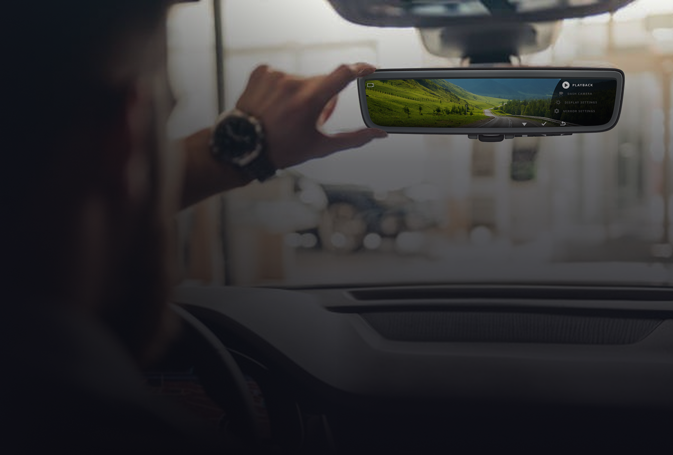
Ford Full Display Dash Mirror
Leading UX design and research for a digital rearview mirror system - from concept to production across European Ford Transit delivery vehicles.
THE PROBLEM
Ford needed a dash camera system for its European commercial fleet. Clients using Ford Transit vehicles wanted to record events around the vehicle during deliveries, both on and off road, to protect their drivers and the packages they carried.
THE ASSIGNMENT
Gentex tasked my team with creating a complete white-label dash camera experience: a rearview mirror with built-in dash camera capabilities, a companion mobile app that pairs with the mirror, and the physical design of the mirror itself. I led design and research for the mirror’s HMI (human-machine interface), the on-mirror controls and screens drivers use to operate the dash camera features.
THE RELEASE PLAN & RESULTS
The Ford Full Display Mirror has launched and is in use today in Ford Transit vehicles across Europe. A white-label version of the design is now sold to automotive companies worldwide.
Read Ford’s press release article here:
Digital Rearview Mirror Gives Transit, E-Transit Drivers a High-Def Look at the Road BehindPROJECT RUNDOWN
My Role
Senior UX Designer & Researcher
Focus area
Rearview Mirror HMI
Team
2 UXD · Engineering · Industrial Design Team • Ford Team
vehicle
Ford Transit (European market)
status
Shipped — in production
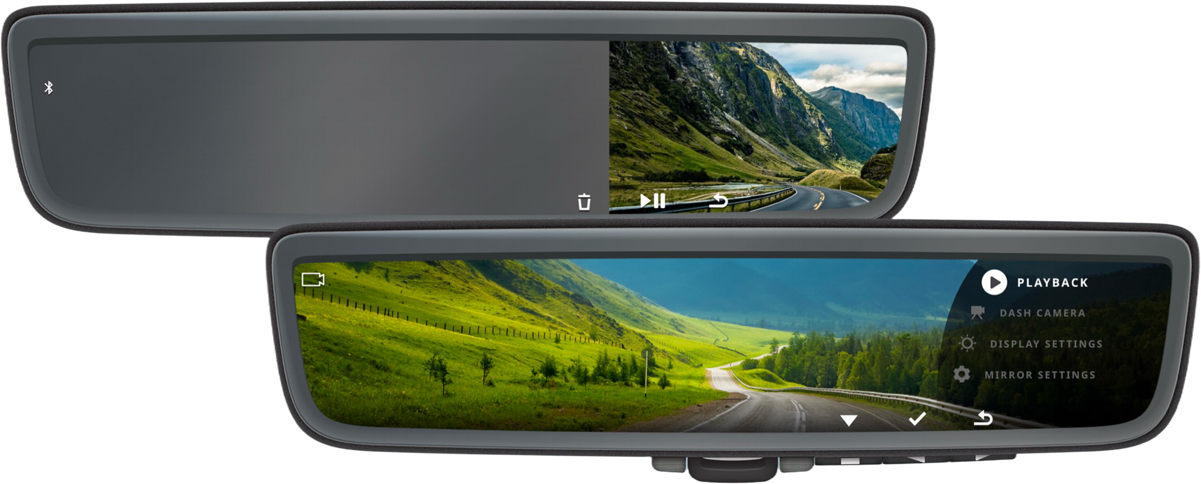
Ford Full Display Dash Camera: Corporate Model
We created a model of the mirror specifi to Ford’s needs
DESIGN PROCESS
This project started from the ground up and depended on close collaboration across disciplines. UX, business, and industrial design worked together across the mobile app, the mirror HMI, and the physical product. We began by benchmarking existing DVR experiences to understand what drivers expected and where current products fell short. We also designed within real constraints. The experience had to work with button layouts and mirror bodies already in production at Gentex, since a new design would have increased costs tenfold. It also had to meet strict European mirror visibility standards, which required the mirror to keep functioning as a rearview mirror. To meet them, I had to keep a required portion of the mirror surface clear of any digital display, which limited how much space the HMI could use.
I began my work on the HMI with whiteboarding, journey mapping, and prototypes we could test in person. Testing with real drivers in a real vehicle showed how the mirror performed in the moments that mattered most: quick glances in traffic, changing light conditions, and shifting attention between the road and the display. Those sessions shaped how we prioritized information and simplified interactions on the mirror.
Throughout the project, we held regular design reviews with Gentex and Ford leadership to evaluate progress and refine the experience. The final design balanced Ford’s specific needs with a flexible foundation for the white-label version, delivering a mirror that was intuitive to use while driving and cost-effective to produce.
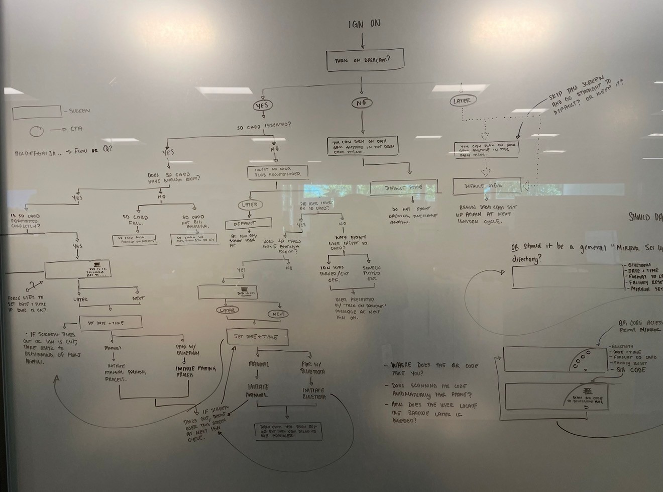
Whiteboarding
I prefer to kickoff design with a whiteboard session. The loose expression of ideas helps me think outside the box and encourages others to participate.
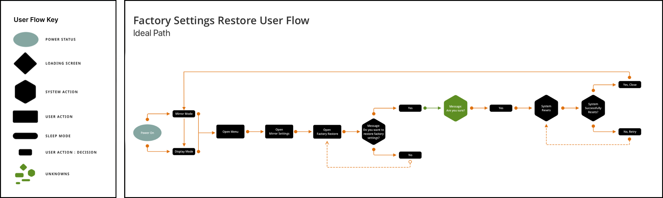
User Flows
I created 25 user flows to work through backend requirements with the engineering team. I find visuals very helpful when discussing matters requiring detailed discussion and documentation.
DESIGNING WITHIN THE LAW
Regulatory constraints that shaped the interface
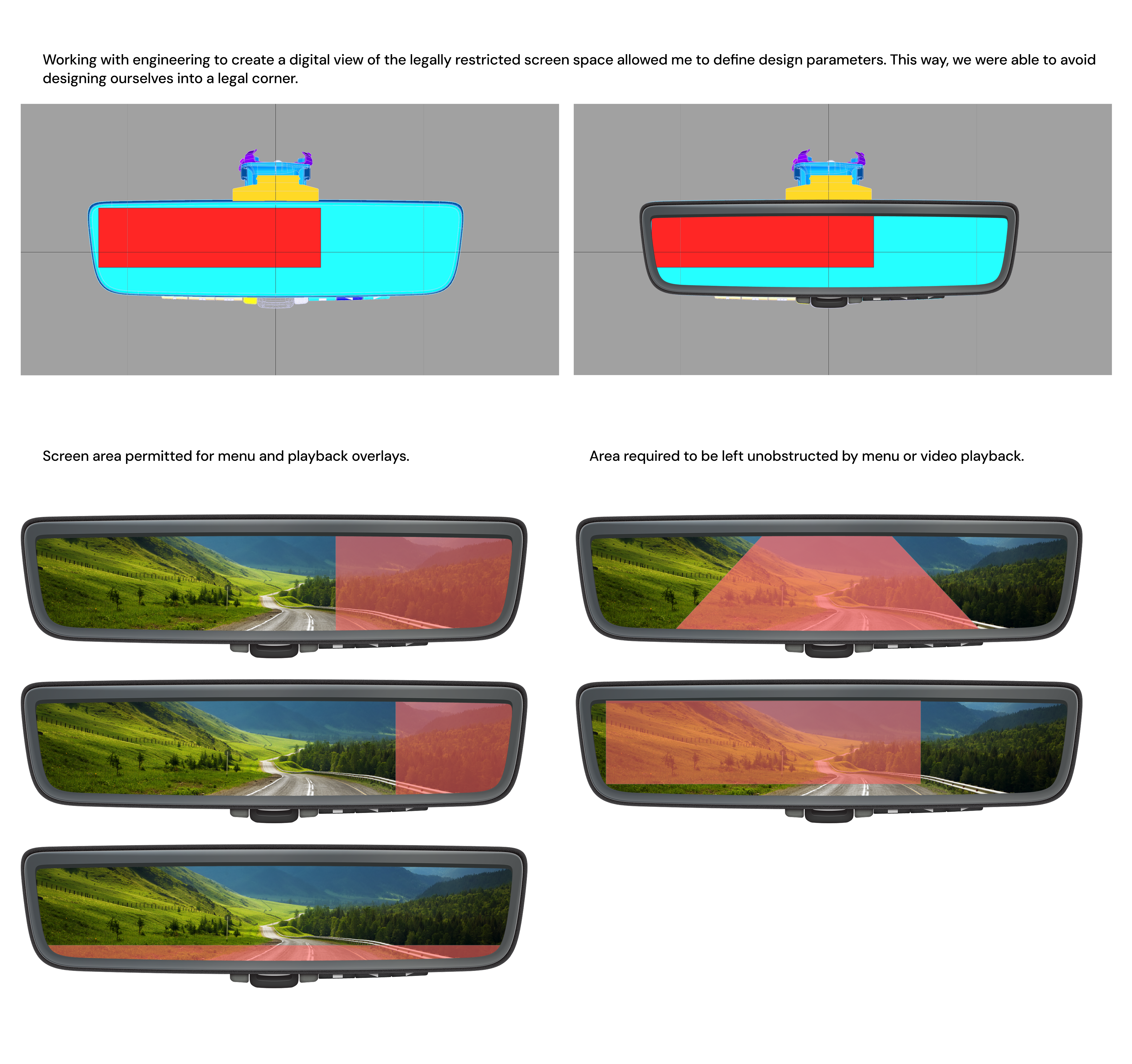
Shipping in Europe meant the Full Display Mirror was governed by a specific set of rules (UN ECE Regulation No. 46 (R46) and ISO 16505) that treat a rearview mirror as a safety-critical device, not just a screen. The driver's view of the road behind could never be meaningfully obstructed while the vehicle was moving.
Two rules shaped the design directly. The mirror had to fail safe: if the screen or camera feed cut out, it instantly reverted to a fully reflective, compliant mirror. And any UI had to respect the rear field of view, so I kept menus and controls within a limited area, ensuring a required portion of the screen always showed the live road.
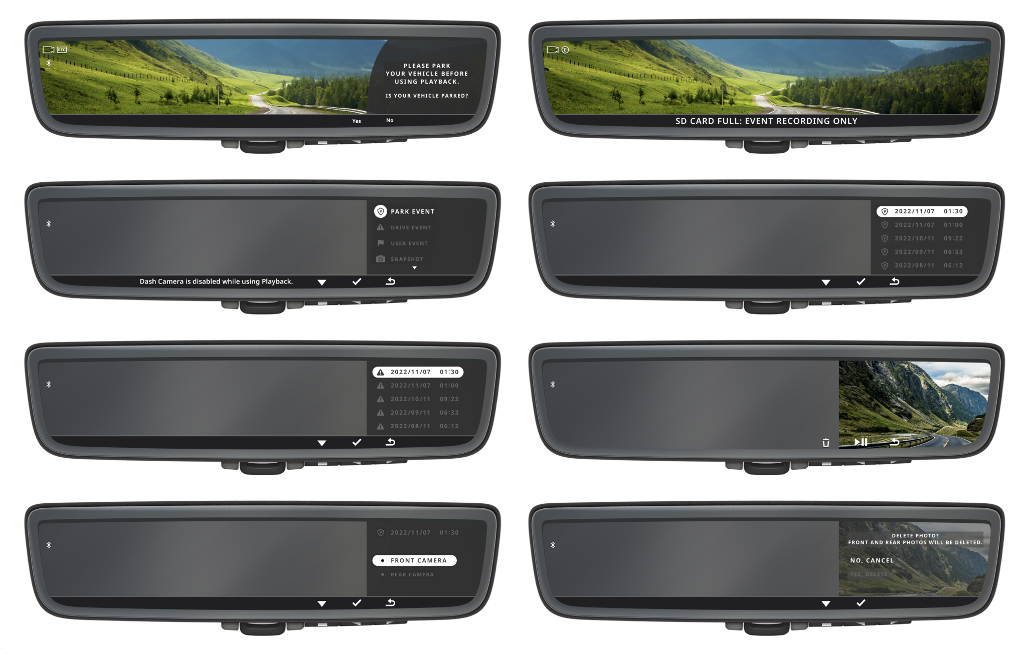
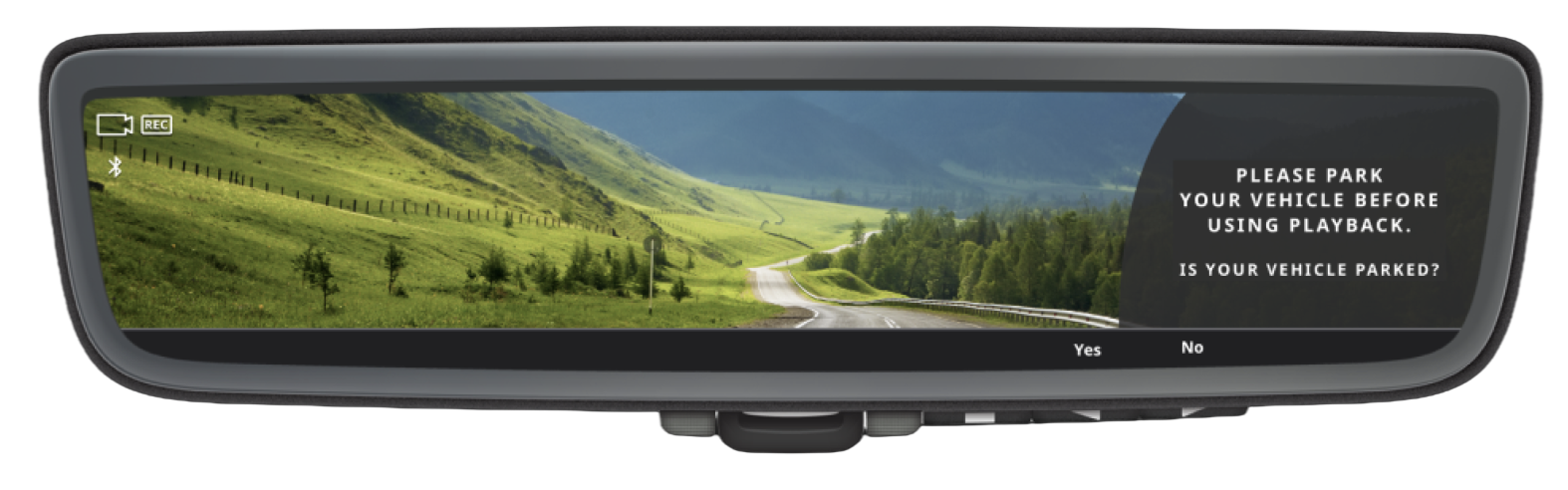
Playback was the exception. Because recorded video implied a parked vehicle, the UI could legally cover more of the screen — but only after the user tapped a button confirming they were parked. That acknowledgment gate was what let us expand the playback layout while keeping live-driving views strictly compliant.
VALIDATION
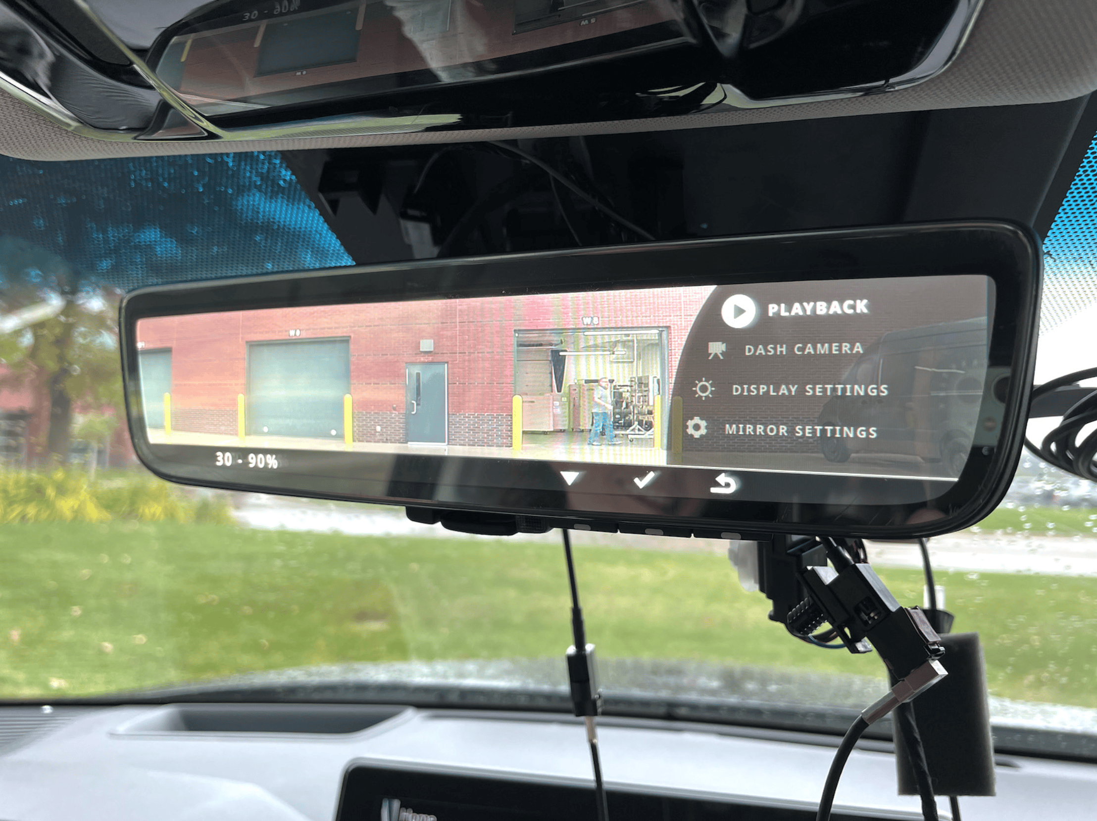
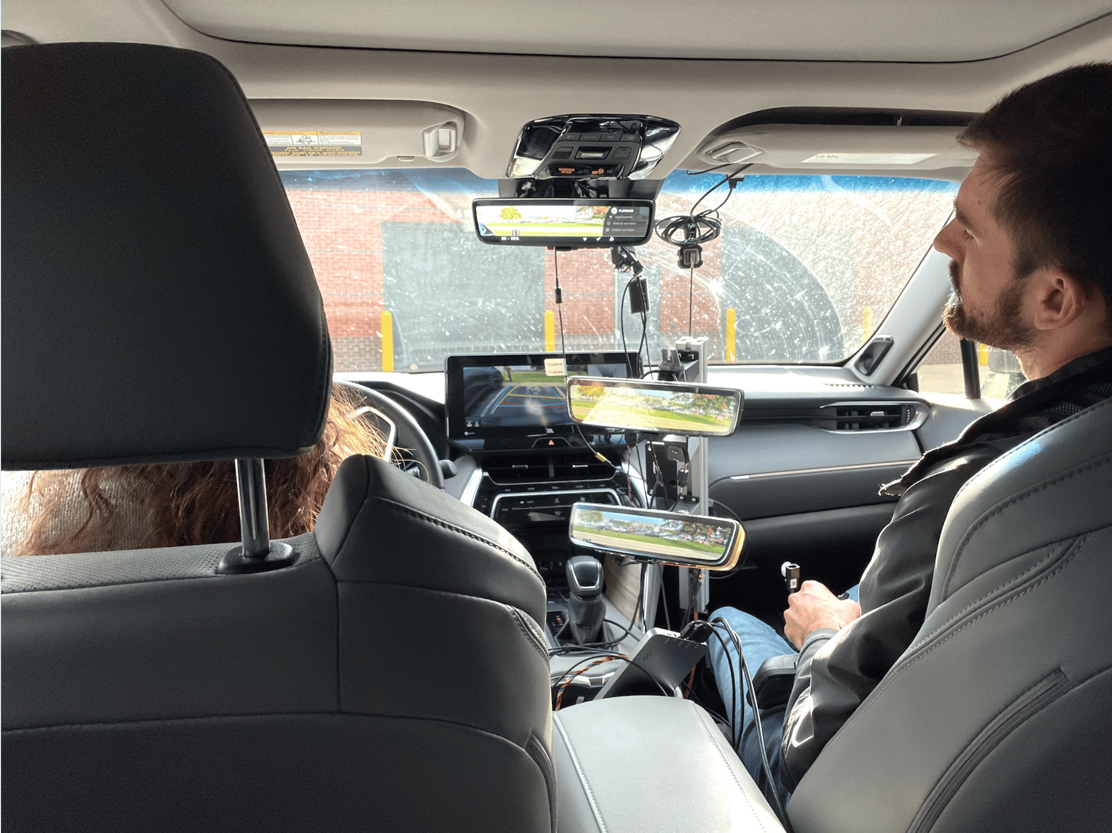
To validate the Full Display Mirror beyond the studio, I led testing in a rigged test vehicle alongside a junior designer I was mentoring through the process. Because we weren't legally permitted to recruit participants from outside Gentex, we tested internally with a pool of around 50 people — and structured the research to get the most out of that constraint. Since driving populations vary widely, we tested in demographic segments of 5–8 users each (for example, younger digital-native drivers versus older drivers who may need larger touch targets and higher-contrast text), so the interface was evaluated against genuinely different needs rather than one averaged-out user. We ran the work as iterative rounds rather than one large test — run five users, fix the top issues, test five more — keeping us continuously improving instead of surfacing every problem at once.
On-road Distraction Testing
The first question was whether the digital mirror was distracting in real driving conditions. Participants drove a mix of city and country routes, deliberately varying the environment and stress level, so we could see whether the screen held up under heavy traffic and open-road conditions alike and whether drivers could rely on it as naturally as a traditional mirror. Driving with real people in a real vehicle showed how the mirror actually performed in the moments that mattered: quick glances in traffic, changing light, and shifting attention between the road and the display.
Parked Interaction & Benchmarking
The second question was how the interface performed when actively used. Given the high-stakes nature of in-car interaction, we measured physical reach and cognitive load safely; with the vehicle parked rather than in motion. Participants worked through the on-screen menu and physical controls (Playback, Dash Camera, Display Settings, Mirror Settings) so we could assess how intuitive the navigation and button layout felt in the driver's hand. Across the full pool, we reached the 20–40+ user range needed to benchmark quantitative metrics like touch-interaction latency and menu-depth efficiency with reasonable confidence, turning observation into measurable design direction.
DETAILED USER FLOWS FOR ENGINEERING
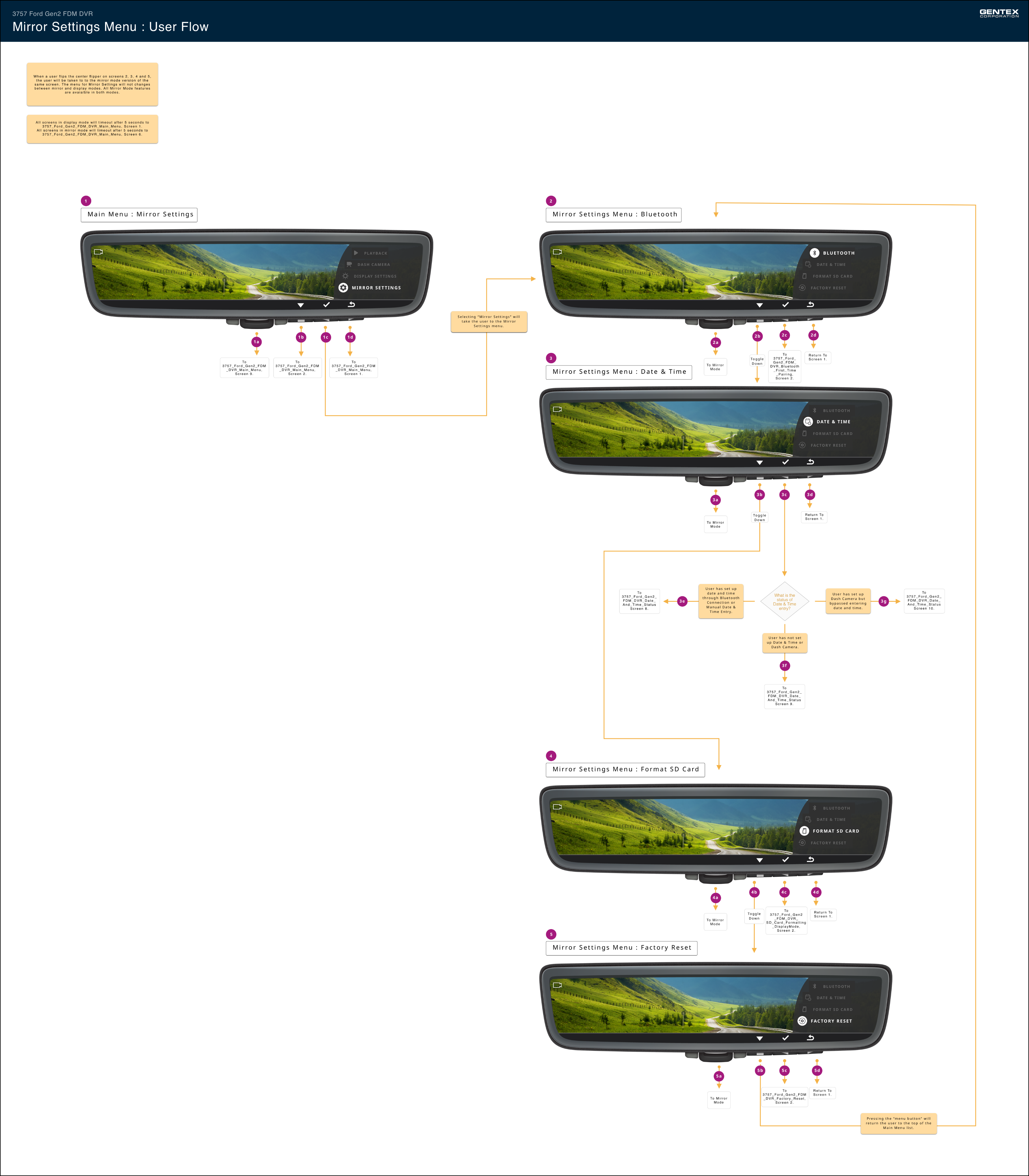
Clear communication between teams is critical on a product this complex, and a visual user flow is one of the best ways to align everyone on how a feature should behave. My team and I created 27 user flows - one per feature interaction in the mirror - which the software requirements team used as the source of truth for writing product requirements.
What makes them reliable is how little they leave to interpretation. Each node is a screen-accurate rendering of exactly what the driver sees, every button is called out with precisely where it routes, and branching logic resolves edge cases on the page rather than leaving them to assumption. Destinations are labeled with a consistent naming convention that maps to a specific flow and screen number, so a reader can take any exit point and immediately locate the corresponding flow within the larger deck — no guesswork about where a path continues.
That precision is what lets the work stand on its own when I'm not in the room; shared over email, or carried by a Product Manager into a meeting with Ford without me there to explain it. A flow built this way speaks for itself: anyone, on any team, can follow it and reach the same understanding, with minimal room for confusion.
SOLUTIONS & RESULTS
For the Ford Full Display Mirror, the design focused on creating a clean, minimally distracting DVR experience that met Ford’s specific needs while serving as a resellable white-label system for future clients. We prioritized high visibility and simple, uncluttered screens that drivers could read at a glance, keeping interactions short so attention stayed on the road. The HMI worked within existing Gentex hardware and European mirror visibility standards, balancing a useful digital display with the mirror’s core job as a rearview mirror.
The Ford Full Display Mirror has launched and is in use today in Ford Transit vehicles across Europe. A white-label version of the design is now sold to automotive companies worldwide, extending the value of the work well beyond the original Ford engagement. The project demonstrated how designing within tight hardware, cost, and legal constraints can produce an experience that is both safe to use while driving and flexible enough to scale across brands and markets.
The Final Product: Ford Full Display Mirror
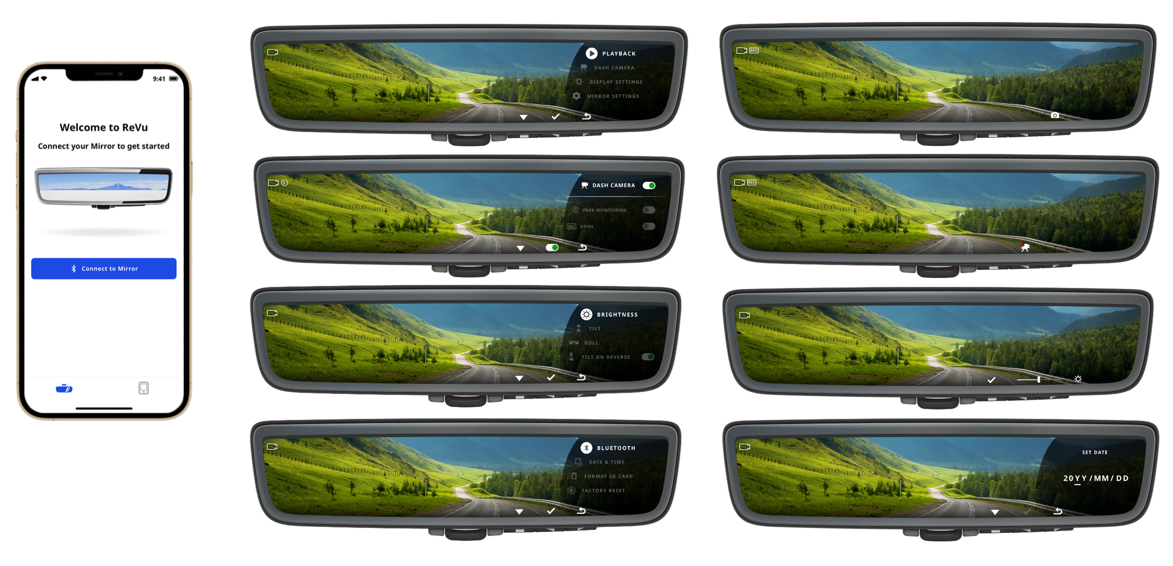
This is a selection of the final, shipped screens from the Full Display Mirror - a look at the polished interface across its core experiences: the main menu, dash camera and recording states, display and brightness adjustment, Bluetooth and date/time setup, event playback, camera selection, and the system prompts and error states that guide the driver (such as the "please park before using playback" confirmation covered in the regulatory work). Together they show how the full system came together into a cohesive, production-ready design.
The screen shown on the phone comes from ReVu, the companion mobile app that pairs with the mirror. That app was designed by another designer on my team - included here to show how the in-mirror experience I worked on connected to the broader product ecosystem.
REFLECTIONS
Common in many infotainment experiences seen in vehicles today, we introduced a bypass in the Playback experience which allowed the user to review recordings even if they were driving. A driver can select “Yes” and proceed to review video playback even if the car is in motion. This is something I would have fought harder against if time had allowed but Ford and leadership were eager to move quickly.
Ford Full Display Dash Mirror
Leading UX design and research for a digital rearview mirror system - from concept to production across European Ford Transit delivery vehicles.
THE PROBLEM
Ford needed a dash camera system for its European commercial fleet. Clients using Ford Transit vehicles wanted to record events around the vehicle during deliveries, both on and off road, to protect their drivers and the packages they carried.
THE ASSIGNMENT
Gentex tasked my team with creating a complete white-label dash camera experience: a rearview mirror with built-in dash camera capabilities, a companion mobile app that pairs with the mirror, and the physical design of the mirror itself. I led design and research for the mirror’s HMI (human-machine interface), the on-mirror controls and screens drivers use to operate the dash camera features.
THE RELEASE PLAN & RESULTS
The Ford Full Display Mirror has launched and is in use today in Ford Transit vehicles across Europe. A white-label version of the design is now sold to automotive companies worldwide.
Read Ford’s press release article here:
Digital Rearview Mirror Gives Transit, E-Transit Drivers a High-Def Look at the Road BehindPROJECT RUNDOWN
My Role
Senior UX Designer & Researcher
Focus Area
Rearview Mirror HMI
Team
2 UXD · Engineering · Industrial Design Team • Ford Team
vehicle
Ford Transit (European market)
status
Shipped — in production
Ford Full Display Dash Camera: Corporate Model
We created a model of the mirror specifi to Ford’s needs
DESIGN PROCESS
This project started from the ground up and depended on close collaboration across disciplines. UX, business, and industrial design worked together across the mobile app, the mirror HMI, and the physical product. We began by benchmarking existing DVR experiences to understand what drivers expected and where current products fell short. We also designed within real constraints. The experience had to work with button layouts and mirror bodies already in production at Gentex, since a new design would have increased costs tenfold. It also had to meet strict European mirror visibility standards, which required the mirror to keep functioning as a rearview mirror. To meet them, I had to keep a required portion of the mirror surface clear of any digital display, which limited how much space the HMI could use.
I began my work on the HMI with whiteboarding, journey mapping, and prototypes we could test in person. Testing with real drivers in a real vehicle showed how the mirror performed in the moments that mattered most: quick glances in traffic, changing light conditions, and shifting attention between the road and the display. Those sessions shaped how we prioritized information and simplified interactions on the mirror.
Throughout the project, we held regular design reviews with Gentex and Ford leadership to evaluate progress and refine the experience. The final design balanced Ford’s specific needs with a flexible foundation for the white-label version, delivering a mirror that was intuitive to use while driving and cost-effective to produce.
Whiteboarding
I prefer to kickoff design with a whiteboard session. The loose expression of ideas helps me think outside the box and encourages others to participate.
User Flows
I created 25 user flows to work through backend requirements with the engineering team. I find visuals very helpful when discussing matters requiring detailed discussion and documentation.
DESIGNING WITHIN THE LAW
Regulatory constraints that shaped the interface
Shipping in Europe meant the Full Display Mirror was governed by a specific set of rules (UN ECE Regulation No. 46 (R46) and ISO 16505) that treat a rearview mirror as a safety-critical device, not just a screen. The driver's view of the road behind could never be meaningfully obstructed while the vehicle was moving.
Two rules shaped the design directly. The mirror had to fail safe: if the screen or camera feed cut out, it instantly reverted to a fully reflective, compliant mirror. And any UI had to respect the rear field of view, so I kept menus and controls within a limited area, ensuring a required portion of the screen always showed the live road.
Playback was the exception. Because recorded video implied a parked vehicle, the UI could legally cover more of the screen — but only after the user tapped a button confirming they were parked. That acknowledgment gate was what let us expand the playback layout while keeping live-driving views strictly compliant.
VALIDATION
To validate the Full Display Mirror beyond the studio, I led testing in a rigged test vehicle alongside a junior designer I was mentoring through the process. Because we weren't legally permitted to recruit participants from outside Gentex, we tested internally with a pool of around 50 people — and structured the research to get the most out of that constraint. Since driving populations vary widely, we tested in demographic segments of 5–8 users each (for example, younger digital-native drivers versus older drivers who may need larger touch targets and higher-contrast text), so the interface was evaluated against genuinely different needs rather than one averaged-out user. We ran the work as iterative rounds rather than one large test — run five users, fix the top issues, test five more — keeping us continuously improving instead of surfacing every problem at once.
On-road Distraction Testing
The first question was whether the digital mirror was distracting in real driving conditions. Participants drove a mix of city and country routes, deliberately varying the environment and stress level, so we could see whether the screen held up under heavy traffic and open-road conditions alike and whether drivers could rely on it as naturally as a traditional mirror. Driving with real people in a real vehicle showed how the mirror actually performed in the moments that mattered: quick glances in traffic, changing light, and shifting attention between the road and the display.
Parked Interaction & Benchmarking
The second question was how the interface performed when actively used. Given the high-stakes nature of in-car interaction, we measured physical reach and cognitive load safely; with the vehicle parked rather than in motion. Participants worked through the on-screen menu and physical controls (Playback, Dash Camera, Display Settings, Mirror Settings) so we could assess how intuitive the navigation and button layout felt in the driver's hand. Across the full pool, we reached the 20–40+ user range needed to benchmark quantitative metrics like touch-interaction latency and menu-depth efficiency with reasonable confidence, turning observation into measurable design direction.
DETAILED USER FLOWS FOR ENGINEERING
Clear communication between teams is critical on a product this complex, and a visual user flow is one of the best ways to align everyone on how a feature should behave. My team and I created 27 user flows - one per feature interaction in the mirror - which the software requirements team used as the source of truth for writing product requirements.
What makes them reliable is how little they leave to interpretation. Each node is a screen-accurate rendering of exactly what the driver sees, every button is called out with precisely where it routes, and branching logic resolves edge cases on the page rather than leaving them to assumption. Destinations are labeled with a consistent naming convention that maps to a specific flow and screen number, so a reader can take any exit point and immediately locate the corresponding flow within the larger deck — no guesswork about where a path continues.
That precision is what lets the work stand on its own when I'm not in the room; shared over email, or carried by a Product Manager into a meeting with Ford without me there to explain it. A flow built this way speaks for itself: anyone, on any team, can follow it and reach the same understanding, with minimal room for confusion.
SOLUTIONS & RESULTS
For the Ford Full Display Mirror, the design focused on creating a clean, minimally distracting DVR experience that met Ford’s specific needs while serving as a resellable white-label system for future clients. We prioritized high visibility and simple, uncluttered screens that drivers could read at a glance, keeping interactions short so attention stayed on the road. The HMI worked within existing Gentex hardware and European mirror visibility standards, balancing a useful digital display with the mirror’s core job as a rearview mirror.
The Ford Full Display Mirror has launched and is in use today in Ford Transit vehicles across Europe. A white-label version of the design is now sold to automotive companies worldwide, extending the value of the work well beyond the original Ford engagement. The project demonstrated how designing within tight hardware, cost, and legal constraints can produce an experience that is both safe to use while driving and flexible enough to scale across brands and markets.
The Final Product: Ford Full Display Mirror
This is a selection of the final, shipped screens from the Full Display Mirror - a look at the polished interface across its core experiences: the main menu, dash camera and recording states, display and brightness adjustment, Bluetooth and date/time setup, event playback, camera selection, and the system prompts and error states that guide the driver (such as the "please park before using playback" confirmation covered in the regulatory work). Together they show how the full system came together into a cohesive, production-ready design.
The screen shown on the phone comes from ReVu, the companion mobile app that pairs with the mirror. That app was designed by another designer on my team - included here to show how the in-mirror experience I worked on connected to the broader product ecosystem.
REFLECTIONS
Common in many infotainment experiences seen in vehicles today, we introduced a bypass in the Playback experience which allowed the user to review recordings even if they were driving. A driver can select “Yes” and proceed to review video playback even if the car is in motion. This is something I would have fought harder against if time had allowed but Ford and leadership were eager to move quickly.
Ford Full Display Dash Mirror
Leading UX design and research for a digital rearview mirror system - from concept to production across European Ford Transit delivery vehicles.
THE PROBLEM
Ford needed a dash camera system for its European commercial fleet. Clients using Ford Transit vehicles wanted to record events around the vehicle during deliveries, both on and off road, to protect their drivers and the packages they carried.
THE ASSIGNMENT
Gentex tasked my team with creating a complete white-label dash camera experience: a rearview mirror with built-in dash camera capabilities, a companion mobile app that pairs with the mirror, and the physical design of the mirror itself. I led design and research for the mirror’s HMI (human-machine interface), the on-mirror controls and screens drivers use to operate the dash camera features.
THE RELEASE PLAN & RESULTS
The Ford Full Display Mirror has launched and is in use today in Ford Transit vehicles across Europe. A white-label version of the design is now sold to automotive companies worldwide.
Read Ford’s press release article here:
Digital Rearview Mirror Gives Transit, E-Transit Drivers a High-Def Look at the Road BehindPROJECT RUNDOWN
My Role
Senior UX Designer & Researcher
Focus area
Rearview Mirror HMI
Team
2 UXD · Engineering · Industrial Design Team • Ford Team
vehicle
Ford Transit (European market)
status
Shipped — in production
Ford Full Display Dash Camera: Corporate Model
We designed a version of the mirror tailored to Ford’s needs, along with a white-label version for future sales to other companies.
DESIGN PROCESS
This project started from the ground up and depended on close collaboration across disciplines. UX, business, and industrial design worked together across the mobile app, the mirror HMI, and the physical product. We began by benchmarking existing DVR experiences to understand what drivers expected and where current products fell short. We also designed within real constraints. The experience had to work with button layouts and mirror bodies already in production at Gentex, since a new design would have increased costs tenfold. It also had to meet strict European mirror visibility standards, which required the mirror to keep functioning as a rearview mirror. To meet them, I had to keep a required portion of the mirror surface clear of any digital display, which limited how much space the HMI could use.
I began my work on the HMI with whiteboarding, journey mapping, and prototypes we could test in person. Testing with real drivers in a real vehicle showed how the mirror performed in the moments that mattered most: quick glances in traffic, changing light conditions, and shifting attention between the road and the display. Those sessions shaped how we prioritized information and simplified interactions on the mirror.
Throughout the project, we held regular design reviews with Gentex and Ford leadership to evaluate progress and refine the experience. The final design balanced Ford’s specific needs with a flexible foundation for the white-label version, delivering a mirror that was intuitive to use while driving and cost-effective to produce.
Whiteboarding
I prefer to kickoff design with a whiteboard session. The loose expression of ideas helps me think outside the box and encourages others to participate.
User Flows
I created 25 user flows to work through backend requirements with the engineering team. I find visuals very helpful when discussing matters requiring detailed discussion and documentation.
DESIGNING WITHIN THE LAW
Regulatory constraints that shaped the interface
Shipping in Europe meant the Full Display Mirror was governed by a specific set of rules (UN ECE Regulation No. 46 (R46) and ISO 16505) that treat a rearview mirror as a safety-critical device, not just a screen. The driver's view of the road behind could never be meaningfully obstructed while the vehicle was moving.
Two rules shaped the design directly. The mirror had to fail safe: if the screen or camera feed cut out, it instantly reverted to a fully reflective, compliant mirror. And any UI had to respect the rear field of view, so I kept menus and controls within a limited area, ensuring a required portion of the screen always showed the live road.
Playback was the exception. Because recorded video implied a parked vehicle, the UI could legally cover more of the screen — but only after the user tapped a button confirming they were parked. That acknowledgment gate was what let us expand the playback layout while keeping live-driving views strictly compliant.
VALIDATION
To validate the Full Display Mirror beyond the studio, I led testing in a rigged test vehicle alongside a junior designer I was mentoring through the process. Because we weren't legally permitted to recruit participants from outside Gentex, we tested internally with a pool of around 50 people — and structured the research to get the most out of that constraint. Since driving populations vary widely, we tested in demographic segments of 5–8 users each (for example, younger digital-native drivers versus older drivers who may need larger touch targets and higher-contrast text), so the interface was evaluated against genuinely different needs rather than one averaged-out user. We ran the work as iterative rounds rather than one large test — run five users, fix the top issues, test five more — keeping us continuously improving instead of surfacing every problem at once.
On-road Distraction Testing
The first question was whether the digital mirror was distracting in real driving conditions. Participants drove a mix of city and country routes, deliberately varying the environment and stress level, so we could see whether the screen held up under heavy traffic and open-road conditions alike and whether drivers could rely on it as naturally as a traditional mirror. Driving with real people in a real vehicle showed how the mirror actually performed in the moments that mattered: quick glances in traffic, changing light, and shifting attention between the road and the display.
Parked Interaction & Benchmarking
The second question was how the interface performed when actively used. Given the high-stakes nature of in-car interaction, we measured physical reach and cognitive load safely; with the vehicle parked rather than in motion. Participants worked through the on-screen menu and physical controls (Playback, Dash Camera, Display Settings, Mirror Settings) so we could assess how intuitive the navigation and button layout felt in the driver's hand. Across the full pool, we reached the 20–40+ user range needed to benchmark quantitative metrics like touch-interaction latency and menu-depth efficiency with reasonable confidence, turning observation into measurable design direction.
DETAILED USER FLOWS FOR ENGINEERING
Clear communication between teams is critical on a product this complex, and a visual user flow is one of the best ways to align everyone on how a feature should behave. My team and I created 27 user flows - one per feature interaction in the mirror - which the software requirements team used as the source of truth for writing product requirements.
What makes them reliable is how little they leave to interpretation. Each node is a screen-accurate rendering of exactly what the driver sees, every button is called out with precisely where it routes, and branching logic resolves edge cases on the page rather than leaving them to assumption. Destinations are labeled with a consistent naming convention that maps to a specific flow and screen number, so a reader can take any exit point and immediately locate the corresponding flow within the larger deck — no guesswork about where a path continues.
That precision is what lets the work stand on its own when I'm not in the room; shared over email, or carried by a Product Manager into a meeting with Ford without me there to explain it. A flow built this way speaks for itself: anyone, on any team, can follow it and reach the same understanding, with minimal room for confusion.
SOLUTIONS & RESULTS
For the Ford Full Display Mirror, the design focused on creating a clean, minimally distracting DVR experience that met Ford’s specific needs while serving as a resellable white-label system for future clients. We prioritized high visibility and simple, uncluttered screens that drivers could read at a glance, keeping interactions short so attention stayed on the road. The HMI worked within existing Gentex hardware and European mirror visibility standards, balancing a useful digital display with the mirror’s core job as a rearview mirror.
The Ford Full Display Mirror has launched and is in use today in Ford Transit vehicles across Europe. A white-label version of the design is now sold to automotive companies worldwide, extending the value of the work well beyond the original Ford engagement. The project demonstrated how designing within tight hardware, cost, and legal constraints can produce an experience that is both safe to use while driving and flexible enough to scale across brands and markets.
The Final Product: Ford Full Display Mirror
This is a selection of the final, shipped screens from the Full Display Mirror - a look at the polished interface across its core experiences: the main menu, dash camera and recording states, display and brightness adjustment, Bluetooth and date/time setup, event playback, camera selection, and the system prompts and error states that guide the driver (such as the "please park before using playback" confirmation covered in the regulatory work). Together they show how the full system came together into a cohesive, production-ready design.
The screen shown on the phone comes from ReVu, the companion mobile app that pairs with the mirror. That app was designed by another designer on my team - included here to show how the in-mirror experience I worked on connected to the broader product ecosystem.
REFLECTIONS
Common in many infotainment experiences seen in vehicles today, we introduced a bypass in the Playback experience which allowed the user to review recordings even if they were driving. A driver can select “Yes” and proceed to review video playback even if the car is in motion. This is something I would have fought harder against if time had allowed but Ford and leadership were eager to move quickly.