

HomeCare+
Designing the employee experience for Lowe's home maintenance service — connecting customers with trained specialists through a purpose-built job management and checkout system.
THE PROBLEM
Lowe’s was launching a first of its kind subscription service and needed a way for associates to quickly and knowledgeably sign customers up while in-store.
THE ASSIGNMENT
Design a customer sign-up experience for the assisted checkout experience that is quick and easy to follow for an associate at any level of experience.
THE RELEASE PLAN & RESULTS
The HomeCare+ experience has been released to all 1,758 Lowe’s stores in 50 states and since it’s release it has gained nearly 16,000 subscribers and $1.5M in revenue in its first six months.
Read the Lowe’s press release article here:
Lowe's Launches an Associate-Powered Home Maintenance Subscription Called HomeCare+ NationwidePROJECT RUNDOWN
My Role
Senior UX Designer
focus area
Employee Desktop Experience + Assisted Checkout
Team
2 UXD · 2 PM · 8 Engineers · 2 Content Strategists
Platform
Desktop, Associate Facing Program
Scope
1,758 stores, 50 US states
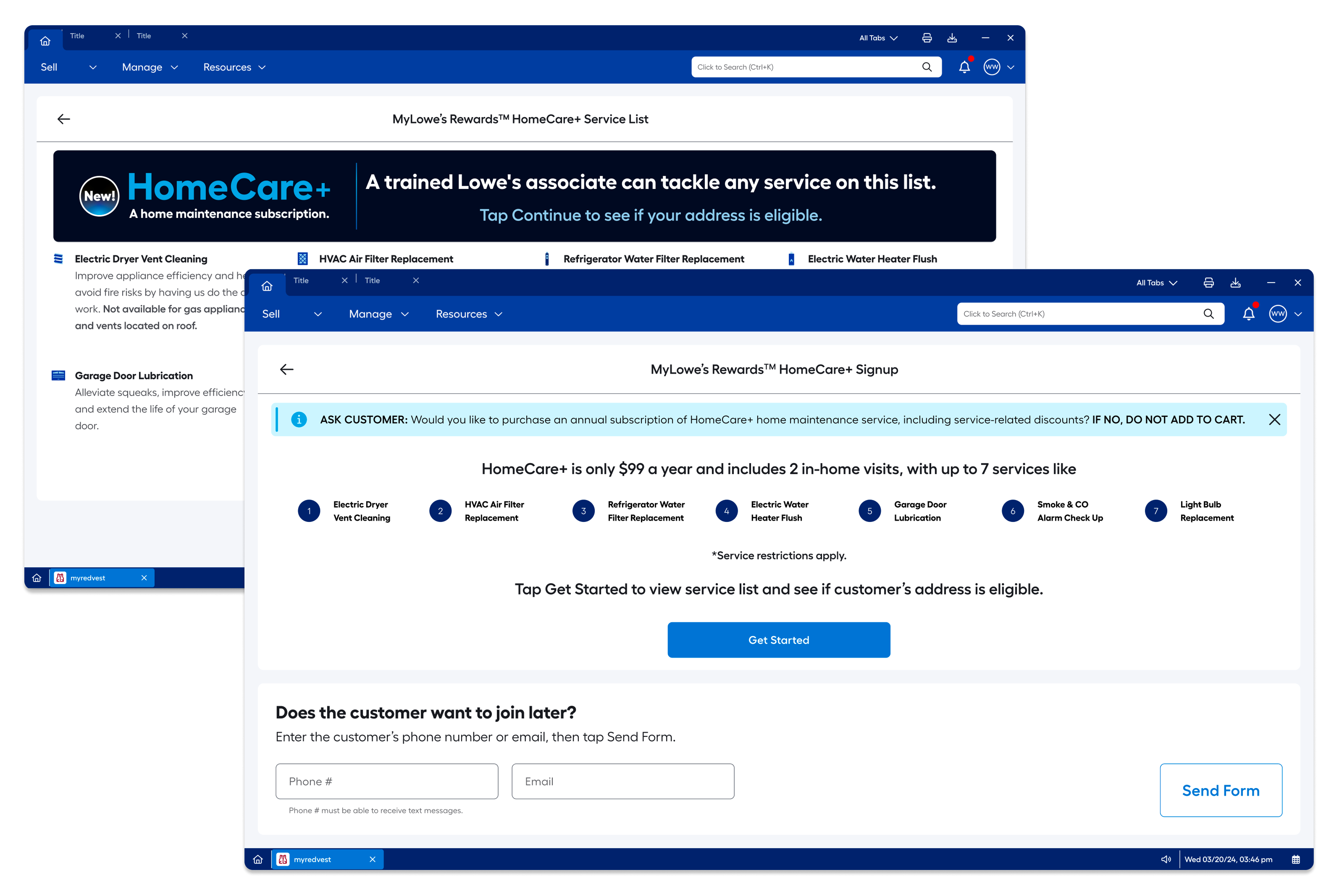
HomeCare+ Assisted Checkout Experience
Assisted checkout is when an associate assists a customer during checkout rather than the customer checking out by themselves.
DESIGN PROCESS
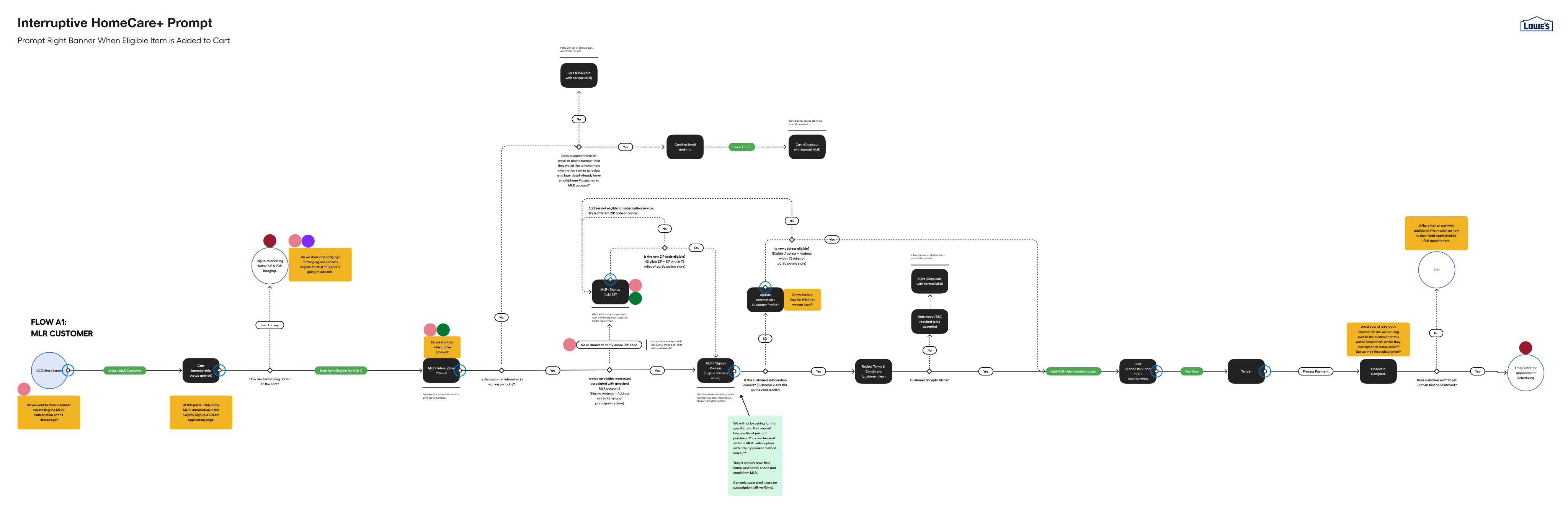
HomeCare+ began with a fast, aggressive ask from leadership. The mobile UX team had been building the customer-facing sign-up experience, but no one had yet considered how associates would enroll customers in the program. That gap became the focus: an associate-facing sign-up experience that worked for anyone, whether they were in their first week or their twentieth year with the company. Before beginning design, I built out several journey maps to understand how associates and customers would move through the sign-up process together. The maps revealed opportunities to reuse patterns from Lowe’s existing subscription services, keeping the design consistent across Lowe’s experiences.
The goal was to make the sign-up process easy to follow and to equip associates to explain the program’s features and cost to customers with confidence. I ran several rounds of testing to confirm the flow surfaced all the information an associate needed to sell the service. Because business requirements changed frequently throughout the project, the experience went through at least five design iterations before final sign-off. I re-validated each version with associates to make sure the flow stayed clear and usable as requirements shifted.
I aligned the experience with the mobile team’s customer-facing design and worked closely with business and legal partners to ensure it met all of Lowe’s legal requirements. The final design balanced speed to launch with a clear, compliant sign-up flow that associates of any experience level could use.
Journey Map
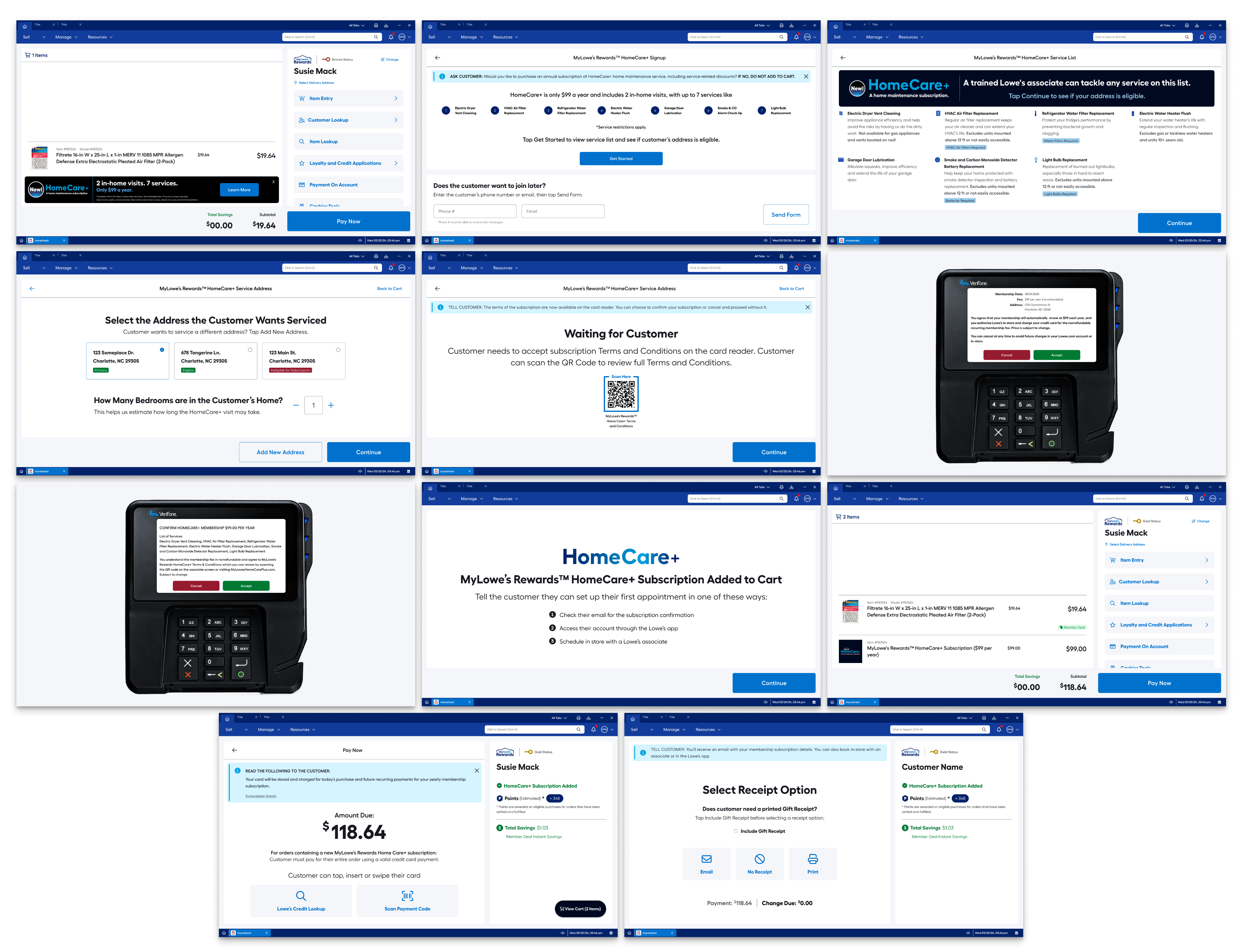
The map above shows the interruptive HomeCare+ Prompt flow. This is when the system recognizes that an eligible item for the HomeCare+ subscription has been added to the cart.
Screens, from left to right.
Top Row: HomeCare+ Banner in Cart, HomeCare+ SignUp Info & Email Page, HomeCare+ Service List.Second Row: Customer Address and Bedroom Count, Waiting for Customer, Customer View: Membership Details.
Third Row: Customer View: HomeCare+ Membership, Subscription Added, Subscription Added to Cart.
Fourth Row: Pay Now, Receipt Options.
VALIDATION
Testing with the people who have to use it.
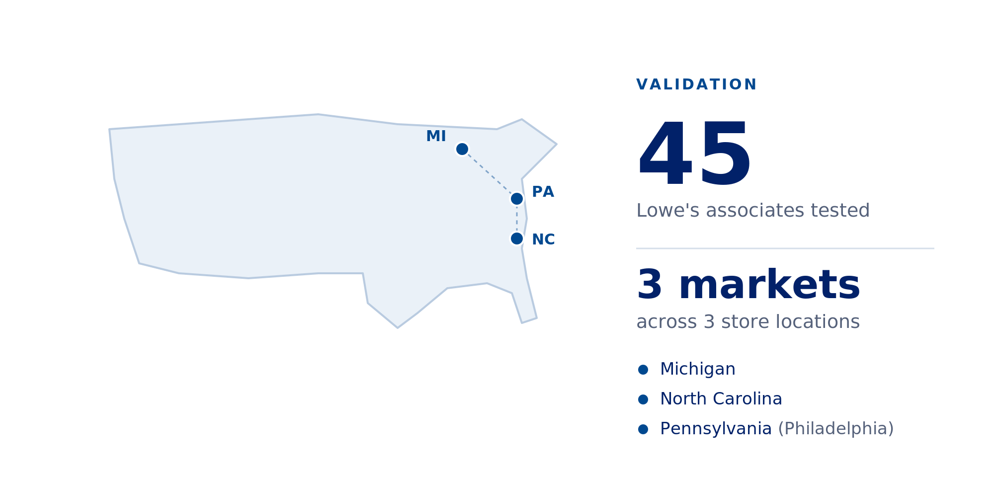
Because this is an associate-facing experience, we validated it with associates, testing with 45 Lowe's employees across three store locations in Michigan, North Carolina, and Pennsylvania. Spanning different regional markets let us see how the enrollment flow held up across different stores, teams, and real-world counter conditions rather than in a single environment.
Testing directly with the associates who'd run HomeCare+ enrollment every day surfaced where the flow was clear and where it needed sharpening - grounding our design decisions in how the tool actually performed in their hands, not how we assumed it would.Throughout testing, we worked closely with the mobile app team who was working on the mobile experience in tandem with us, the Lowe’s legal team, and the Lowe’s marketing team to maintain consistency across platforms and ensure mandatory branding and legal guidelines were being honored.
What We Heard During Testing
37 of 45
associates said that they wanted meaningful information about the HomeCare+ membership brought out earlier in the flow.
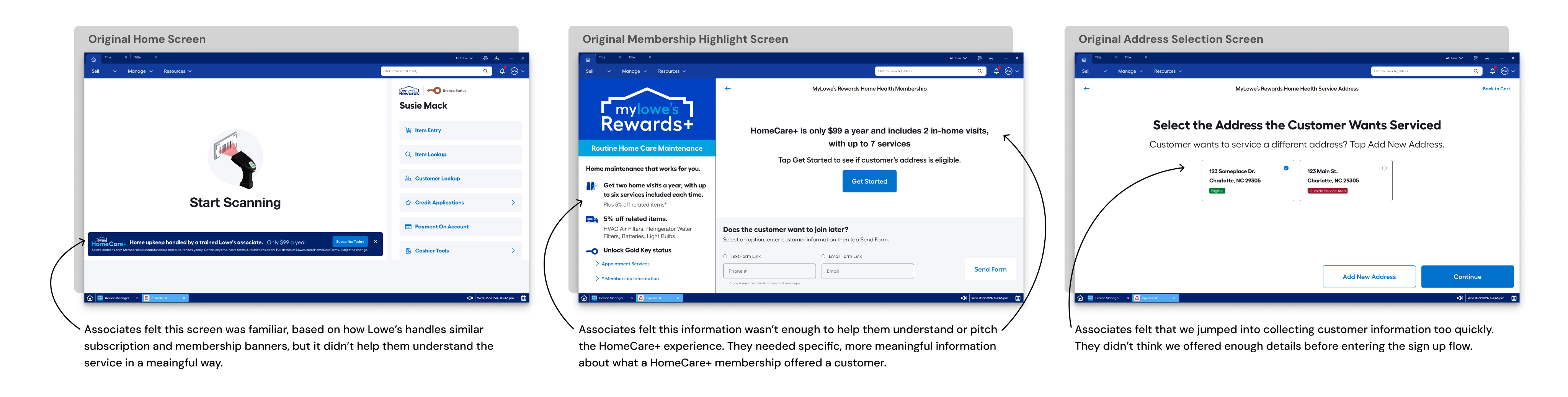
What We Changed
43 of 45
associates said the new information added to the experience would help them understand and pitch the membership to customers.
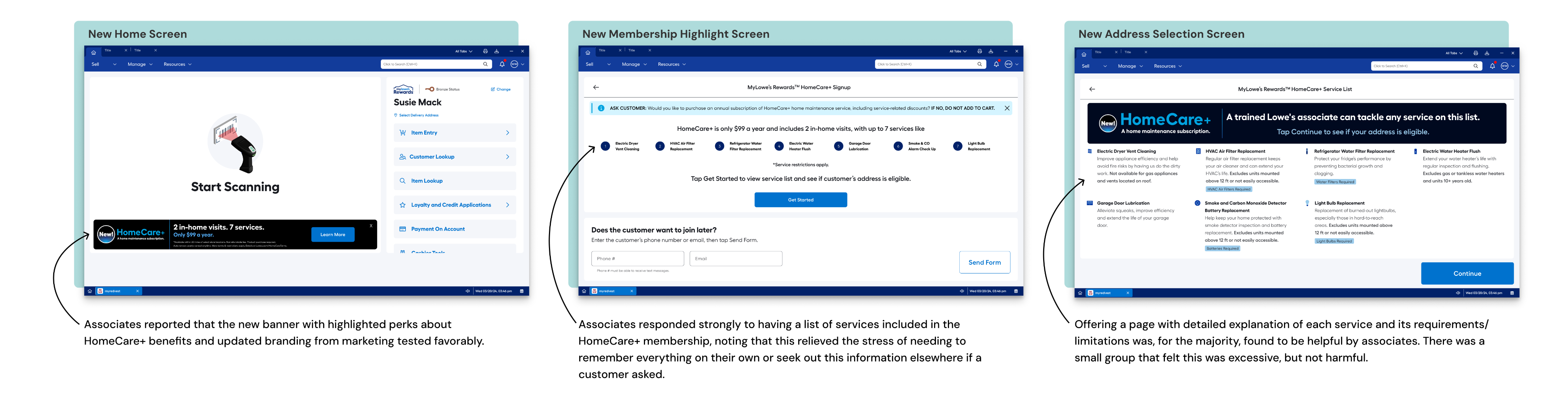
All 3 markets were tested 3 times with 5 associates.The message remained consistent throughout each test session, associates understood how to use the flow, but not what they were selling. So in the final iteration, we focused on bringing HomeCare+'s value forward earlier in the flow.
LEGAL COMPLIANCE
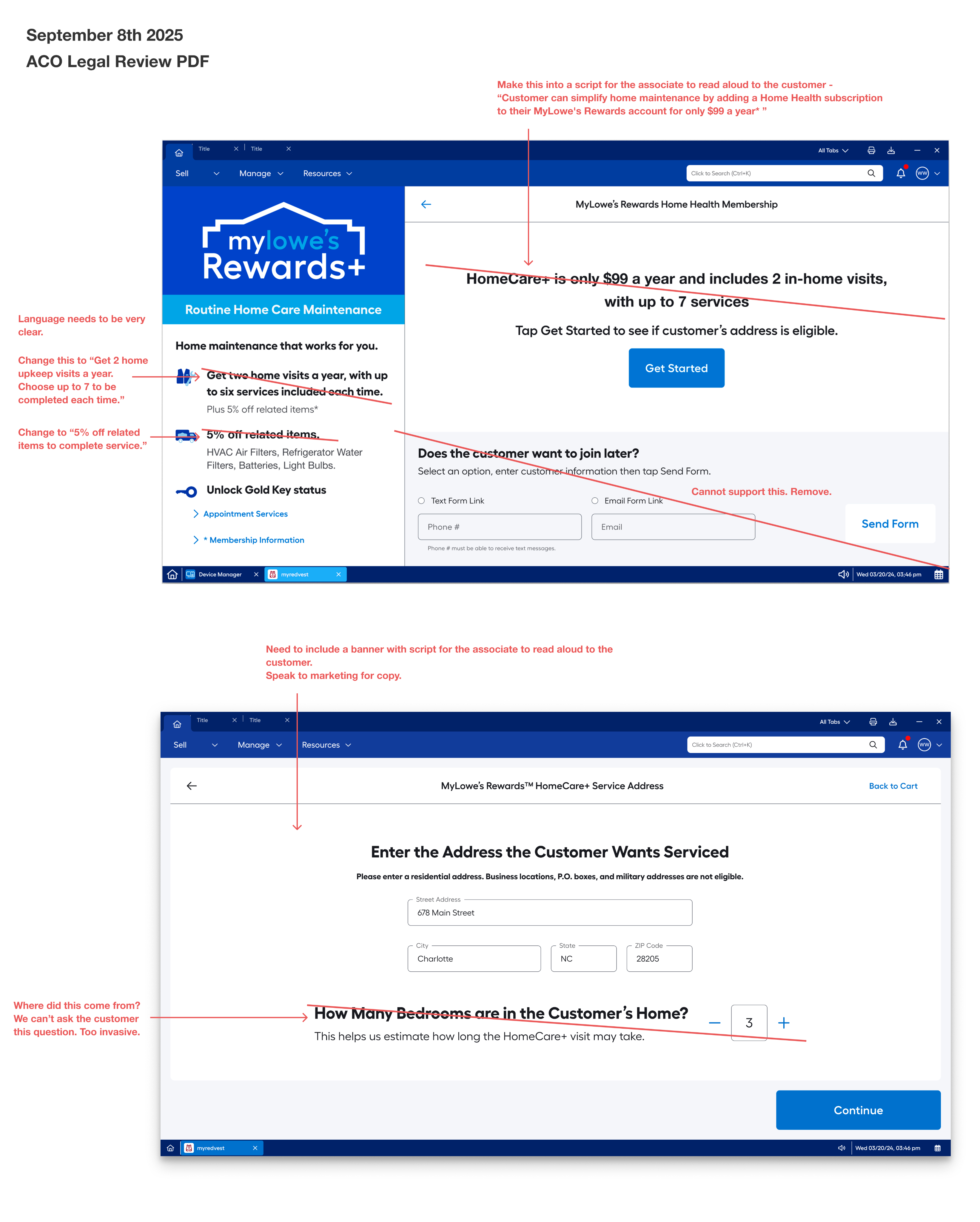
Legal review was a constant throughout the project. We met with Lowe's legal team weekly - often more - to walk through the screens, and emailed batches of our newest designs for review as quickly as we produced them. They regularly sent our designs back as PDFs covered in red ink, seen in the image below. Their job was to ensure the language we used wouldn't expose Lowe's to risk, and they brought strict guidelines and a lot of opinions that we had to work through.
The hardest part wasn't making the changes, it was context. Because HomeCare+ had four parallel enrollment paths (Assisted Checkout, Self Checkout, Mobile, and Web), a wording change legal required on one screen could quietly conflict with how the same moment was phrased in another entry point. We often had to make sure legal saw the full picture before a change was enforced, so a fix in one flow didn't break consistency across the others. Managing requirements while keeping language aligned across every path a customer could take, was a significant and ongoing part of the work that myself and the other three designers for the other experiences would often tackle together to maintain control.
DESIGN SYSTEM & ACCESSIBILITY
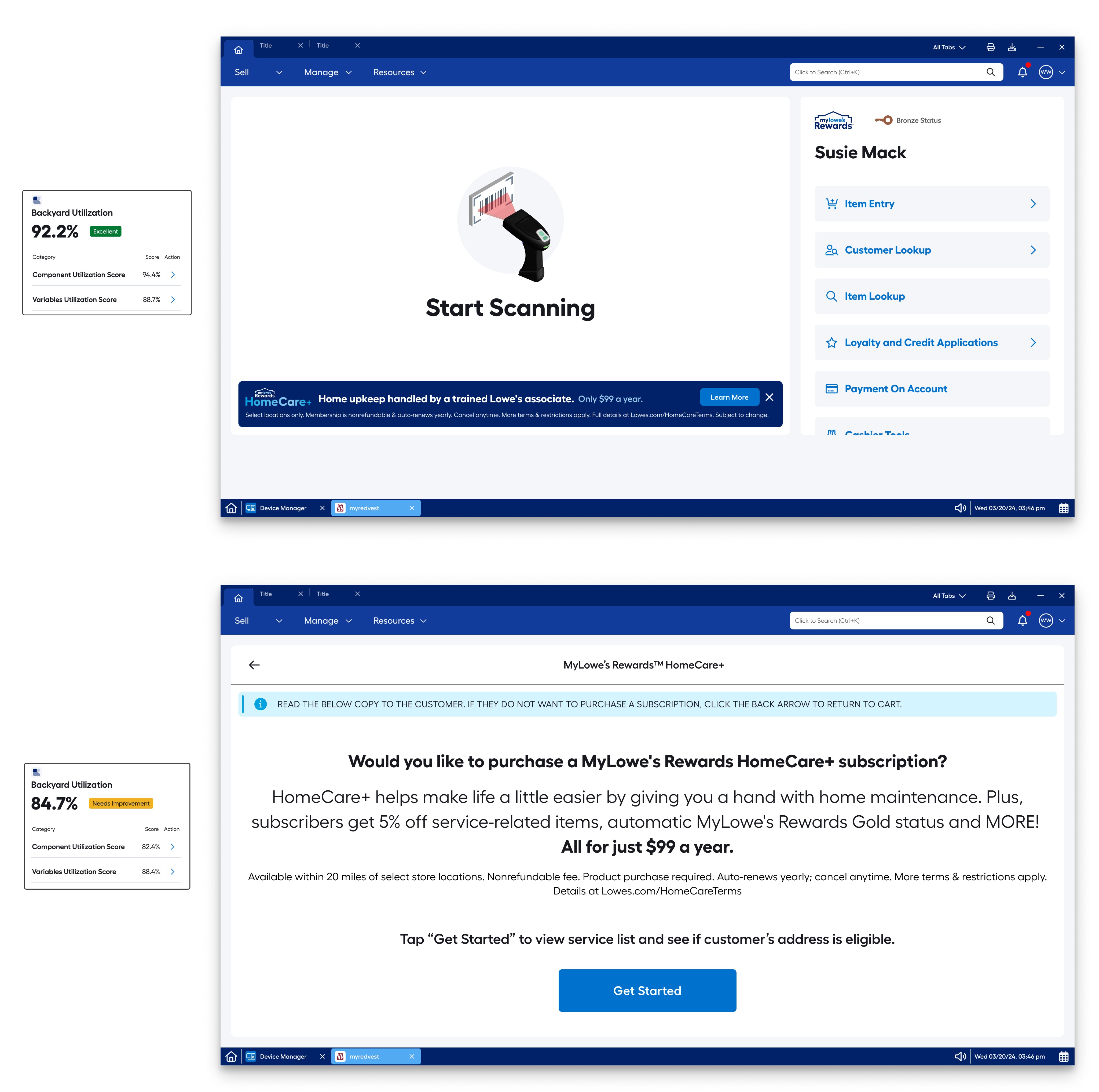
Even as the designs changed rapidly, every screen had to meet a consistent standard of quality. I built exclusively with the latest Lowe's design system assets and designed to WCAG AA/AAA accessibility specifications, validating each screen through the Backyard Utilization Tool — an internal tool built by Lowe's engineers to verify design system compliance.
Designing to these standards isn't just best practice, accessibility is increasingly a legal and ethical baseline, and treating it as non-negotiable from the start meant the work was inclusive, consistent, and production-ready rather than something to retrofit later. Holding that line under a fast, shifting timeline is what kept the final experience both usable for every associate and dependable to ship.
SOLUTIONS & RESULTS
For HomeCare+, the design focused on creating a simple, easy-to-understand sign-up process that associates of any experience level could use to enroll customers with confidence. The experience guided associates through the program’s features and cost so they could explain the service clearly at the point of sale, while adhering to Lowe’s legal requirements and the design system’s accessibility guidelines. After at least five rounds of iteration, the final design earned sign-off from business, legal, and design.
The new experience has delivered strong results since launch. In its first six months, HomeCare+ gained nearly 16,000 subscribers and generated $1.5M in revenue. The project demonstrated the value of designing for the associate side of a new service, not just the customer side, giving associates the clarity and confidence they needed to sell a brand-new program from day one.
REFLECTIONS
I'd fight harder for lighter copy.
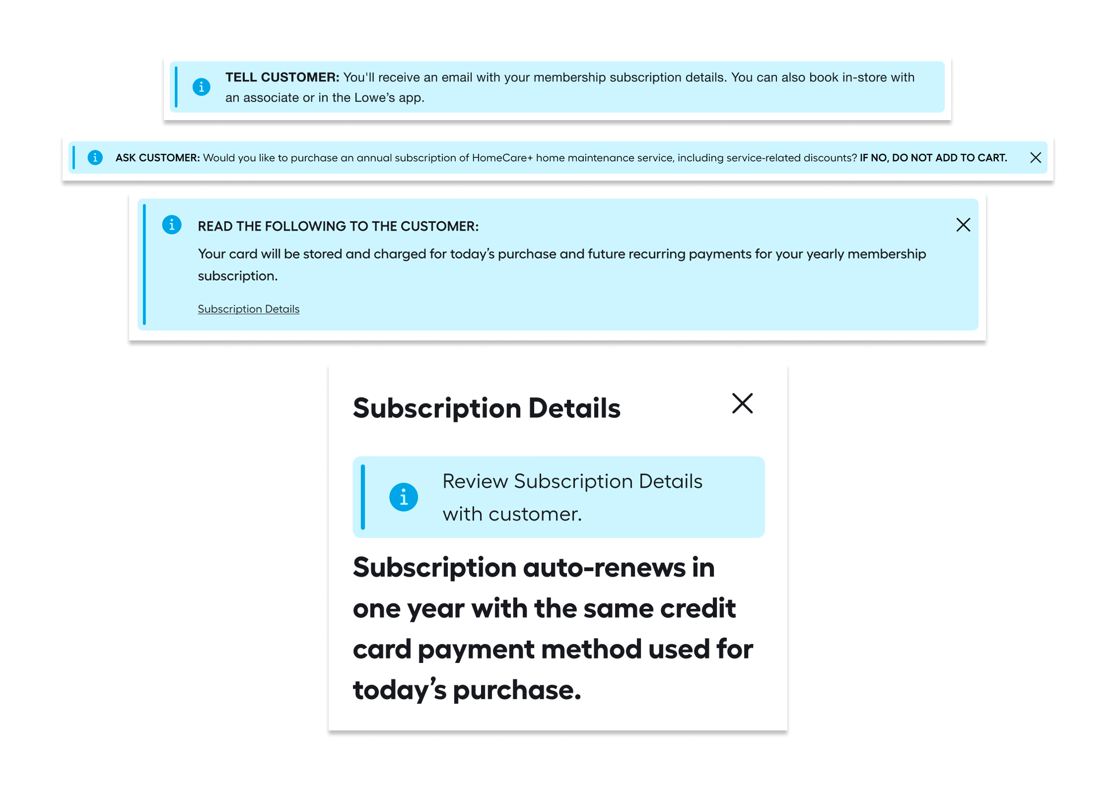
During legal reviews, we were asked to include more text than we would have preferred. We were also asked to include banners that acted like scripts for the associates, instructing them to read aloud. Our team felt this was unneccesary but legal was
HomeCare+
Designing the employee experience for Lowe's home maintenance service — connecting customers with trained specialists through a purpose-built job management and checkout system.
THE PROBLEM
Lowe’s was launching a first of its kind subscription service and needed a way for associates to quickly and knowledgeably sign customers up while in-store.
THE ASSIGNMENT
Design a customer sign-up experience for the assisted checkout experience that is quick and easy to follow for an associate at any level of experience.
THE RELEASE PLAN & RESULTS
The HomeCare+ experience has been released to all 1,758 Lowe’s stores in 50 states and since it’s release it has gained nearly 16,000 subscribers and $1.5M in revenue in its first six months.
Read the Lowe’s press release article here:
Lowe's Launches an Associate-Powered Home Maintenance Subscription Called HomeCare+ NationwidePROJECT RUNDOWN
My Role
Senior UX Designer
focus area
Employee Desktop Experience + Assisted Checkout
Team
2 UXD · 2 PM · 8 Engineers · 2 Content Strategists
Platform
Desktop, Associate Facing Program
Scope
1,758 stores, 50 US states
HomeCare+ Assisted Checkout Experience
Assisted checkout is when an associate assists a customer during checkout rather than the customer checking out by themselves.
DESIGN PROCESS
HomeCare+ began with a fast, aggressive ask from leadership. The mobile UX team had been building the customer-facing sign-up experience, but no one had yet considered how associates would enroll customers in the program. That gap became the focus: an associate-facing sign-up experience that worked for anyone, whether they were in their first week or their twentieth year with the company. Before beginning design, I built out several journey maps to understand how associates and customers would move through the sign-up process together. The maps revealed opportunities to reuse patterns from Lowe’s existing subscription services, keeping the design consistent across Lowe’s experiences.
The goal was to make the sign-up process easy to follow and to equip associates to explain the program’s features and cost to customers with confidence. I ran several rounds of testing to confirm the flow surfaced all the information an associate needed to sell the service. Because business requirements changed frequently throughout the project, the experience went through at least five design iterations before final sign-off. I re-validated each version with associates to make sure the flow stayed clear and usable as requirements shifted.
I aligned the experience with the mobile team’s customer-facing design and worked closely with business and legal partners to ensure it met all of Lowe’s legal requirements. The final design balanced speed to launch with a clear, compliant sign-up flow that associates of any experience level could use.
Journey Map
The map above shows the interruptive HomeCare+ Prompt flow. This is when the system recognizes that an eligible item for the HomeCare+ subscription has been added to the cart.
Screens, from left to right.
Top Row: HomeCare+ Banner in Cart, HomeCare+ SignUp Info & Email Page, HomeCare+ Service List.Second Row: Customer Address and Bedroom Count, Waiting for Customer, Customer View: Membership Details.
Third Row: Customer View: HomeCare+ Membership, Subscription Added, Subscription Added to Cart.
Fourth Row: Pay Now, Receipt Options.
VALIDATION
Testing with the people who have to use it.
Because this is an associate-facing experience, we validated it with associates, testing with 45 Lowe's employees across three store locations in Michigan, North Carolina, and Pennsylvania. Spanning different regional markets let us see how the enrollment flow held up across different stores, teams, and real-world counter conditions rather than in a single environment.
Testing directly with the associates who'd run HomeCare+ enrollment every day surfaced where the flow was clear and where it needed sharpening - grounding our design decisions in how the tool actually performed in their hands, not how we assumed it would.Throughout testing, we worked closely with the mobile app team who was working on the mobile experience in tandem with us, the Lowe’s legal team, and the Lowe’s marketing team to maintain consistency across platforms and ensure mandatory branding and legal guidelines were being honored.
What We Heard During Testing
37 of 45
associates said that they wanted meaningful information about the HomeCare+ membership brought out earlier in the flow.
What We Changed
43 of 45
associates said the new information added to the experience would help them understand and pitch the membership to customers.
All 3 markets were tested 3 times with 5 associates.The message remained consistent throughout each test session, associates understood how to use the flow, but not what they were selling. So in the final iteration, we focused on bringing HomeCare+'s value forward earlier in the flow.
LEGAL COMPLIANCE
Legal review was a constant throughout the project. We met with Lowe's legal team weekly - often more - to walk through the screens, and emailed batches of our newest designs for review as quickly as we produced them. They regularly sent our designs back as PDFs covered in red ink, seen in the image below. Their job was to ensure the language we used wouldn't expose Lowe's to risk, and they brought strict guidelines and a lot of opinions that we had to work through.
The hardest part wasn't making the changes, it was context. Because HomeCare+ had four parallel enrollment paths (Assisted Checkout, Self Checkout, Mobile, and Web), a wording change legal required on one screen could quietly conflict with how the same moment was phrased in another entry point. We often had to make sure legal saw the full picture before a change was enforced, so a fix in one flow didn't break consistency across the others. Managing requirements while keeping language aligned across every path a customer could take, was a significant and ongoing part of the work that myself and the other three designers for the other experiences would often tackle together to maintain control.
DESIGN SYSTEM & ACCESSIBILITY
Even as the designs changed rapidly, every screen had to meet a consistent standard of quality. I built exclusively with the latest Lowe's design system assets and designed to WCAG AA/AAA accessibility specifications, validating each screen through the Backyard Utilization Tool — an internal tool built by Lowe's engineers to verify design system compliance.
Designing to these standards isn't just best practice, accessibility is increasingly a legal and ethical baseline, and treating it as non-negotiable from the start meant the work was inclusive, consistent, and production-ready rather than something to retrofit later. Holding that line under a fast, shifting timeline is what kept the final experience both usable for every associate and dependable to ship.
SOLUTIONS & RESULTS
For HomeCare+, the design focused on creating a simple, easy-to-understand sign-up process that associates of any experience level could use to enroll customers with confidence. The experience guided associates through the program’s features and cost so they could explain the service clearly at the point of sale, while adhering to Lowe’s legal requirements and the design system’s accessibility guidelines. After at least five rounds of iteration, the final design earned sign-off from business, legal, and design.
The new experience has delivered strong results since launch. In its first six months, HomeCare+ gained nearly 16,000 subscribers and generated $1.5M in revenue. The project demonstrated the value of designing for the associate side of a new service, not just the customer side, giving associates the clarity and confidence they needed to sell a brand-new program from day one.
REFLECTIONS
I'd fight harder for lighter copy.
During legal reviews, we were asked to include more text than we would have preferred. We were also asked to include banners that acted like scripts for the associates, instructing them to read aloud. Our team felt this was unneccesary but legal was
HomeCare+
Designing the employee experience for Lowe's home maintenance service — connecting customers with trained specialists through a purpose-built job management and checkout system.
THE PROBLEM
Lowe’s was launching a first of its kind subscription service and needed a way for associates to quickly and knowledgeably sign customers up while in-store.
THE ASSIGNMENT
Design a customer sign-up experience for the assisted checkout experience that is quick and easy to follow for an associate at any level of experience.
THE RELEASE PLAN & RESULTS
The HomeCare+ experience has been released to all 1,758 Lowe’s stores in 50 states and since it’s release it has gained nearly 16,000 subscribers and $1.5M in revenue in its first six months.
Read the Lowe’s press release article here:
Lowe's Launches an Associate-Powered Home Maintenance Subscription Called HomeCare+ NationwidePROJECT RUNDOWN
My Role
Senior UX Designer
focus area
Employee Desktop Experience + Assisted Checkout
Team
2 UXD · 2 PM · 8 Engineers · 2 Content Strategists
Platform
Desktop, Associate Facing Program
Scope
1,758 stores, 50 US states
HomeCare+ Assisted Checkout Experience
Assisted checkout is when an associate assists a customer during checkout rather than the customer checking out by themselves.
DESIGN PROCESS
HomeCare+ began with a fast, aggressive ask from leadership. The mobile UX team had been building the customer-facing sign-up experience, but no one had yet considered how associates would enroll customers in the program. That gap became the focus: an associate-facing sign-up experience that worked for anyone, whether they were in their first week or their twentieth year with the company. Before beginning design, I built out several journey maps to understand how associates and customers would move through the sign-up process together. The maps revealed opportunities to reuse patterns from Lowe’s existing subscription services, keeping the design consistent across Lowe’s experiences.
The goal was to make the sign-up process easy to follow and to equip associates to explain the program’s features and cost to customers with confidence. I ran several rounds of testing to confirm the flow surfaced all the information an associate needed to sell the service. Because business requirements changed frequently throughout the project, the experience went through at least five design iterations before final sign-off. I re-validated each version with associates to make sure the flow stayed clear and usable as requirements shifted.
I aligned the experience with the mobile team’s customer-facing design and worked closely with business and legal partners to ensure it met all of Lowe’s legal requirements. The final design balanced speed to launch with a clear, compliant sign-up flow that associates of any experience level could use.
Journey Map
The map above shows the interruptive HomeCare+ Prompt flow. This is when the system recognizes that an eligible item for the HomeCare+ subscription has been added to the cart.
Screens, from left to right.
Top Row: HomeCare+ Banner in Cart, HomeCare+ SignUp Info & Email Page, HomeCare+ Service List.Second Row: Customer Address and Bedroom Count, Waiting for Customer, Customer View: Membership Details.
Third Row: Customer View: HomeCare+ Membership, Subscription Added, Subscription Added to Cart.
Fourth Row: Pay Now, Receipt Options.
VALIDATION
Testing with the people who have to use it.
Because this is an associate-facing experience, we validated it with associates, testing with 45 Lowe's employees across three store locations in Michigan, North Carolina, and Pennsylvania. Spanning different regional markets let us see how the enrollment flow held up across different stores, teams, and real-world counter conditions rather than in a single environment.
Testing directly with the associates who'd run HomeCare+ enrollment every day surfaced where the flow was clear and where it needed sharpening - grounding our design decisions in how the tool actually performed in their hands, not how we assumed it would.Throughout testing, we worked closely with the mobile app team who was working on the mobile experience in tandem with us, the Lowe’s legal team, and the Lowe’s marketing team to maintain consistency across platforms and ensure mandatory branding and legal guidelines were being honored.
What We Heard During Testing
37 of 45
associates said that they wanted meaningful information about the HomeCare+ membership brought out earlier in the flow.
What We Changed
43 of 45
associates said the new information added to the experience would help them understand and pitch the membership to customers.
All 3 markets were tested 3 times with 5 associates.The message remained consistent throughout each test session, associates understood how to use the flow, but not what they were selling. So in the final iteration, we focused on bringing HomeCare+'s value forward earlier in the flow.
LEGAL COMPLIANCE
Legal review was a constant throughout the project. We met with Lowe's legal team weekly - often more - to walk through the screens, and emailed batches of our newest designs for review as quickly as we produced them. They regularly sent our designs back as PDFs covered in red ink, seen in the image below. Their job was to ensure the language we used wouldn't expose Lowe's to risk, and they brought strict guidelines and a lot of opinions that we had to work through.
The hardest part wasn't making the changes, it was context. Because HomeCare+ had four parallel enrollment paths (Assisted Checkout, Self Checkout, Mobile, and Web), a wording change legal required on one screen could quietly conflict with how the same moment was phrased in another entry point. We often had to make sure legal saw the full picture before a change was enforced, so a fix in one flow didn't break consistency across the others. Managing requirements while keeping language aligned across every path a customer could take, was a significant and ongoing part of the work that myself and the other three designers for the other experiences would often tackle together to maintain control.
DESIGN SYSTEM & ACCESSIBILITY
Even as the designs changed rapidly, every screen had to meet a consistent standard of quality. I built exclusively with the latest Lowe's design system assets and designed to WCAG AA/AAA accessibility specifications, validating each screen through the Backyard Utilization Tool — an internal tool built by Lowe's engineers to verify design system compliance.
Designing to these standards isn't just best practice, accessibility is increasingly a legal and ethical baseline, and treating it as non-negotiable from the start meant the work was inclusive, consistent, and production-ready rather than something to retrofit later. Holding that line under a fast, shifting timeline is what kept the final experience both usable for every associate and dependable to ship.
SOLUTIONS & RESULTS
For HomeCare+, the design focused on creating a simple, easy-to-understand sign-up process that associates of any experience level could use to enroll customers with confidence. The experience guided associates through the program’s features and cost so they could explain the service clearly at the point of sale, while adhering to Lowe’s legal requirements and the design system’s accessibility guidelines. After at least five rounds of iteration, the final design earned sign-off from business, legal, and design.
The new experience has delivered strong results since launch. In its first six months, HomeCare+ gained nearly 16,000 subscribers and generated $1.5M in revenue. The project demonstrated the value of designing for the associate side of a new service, not just the customer side, giving associates the clarity and confidence they needed to sell a brand-new program from day one.
REFLECTIONS
I'd fight harder for lighter copy.
If I could revisit this project, I'd push harder to simplify the language legal asked us to include. Throughout review, we were required to add more text than we felt the experience needed — including banners that functioned as scripts, instructing associates to read specific copy aloud. Our team saw these as clutter that worked against a clean, efficient flow, but legal was firm that they were necessary to avoid confusion.
Looking back, I'd want to challenge that assumption more directly, coming to the table with usability evidence showing how the added text affected the associate experience, and proposing clearer, lighter alternatives that could satisfy legal's concerns without turning the screen into a script. It likely wouldn't have removed every requirement, but a more rigorous, research-backed case might have struck a better balance between compliance and usability, had time allowed.