
Meijer App
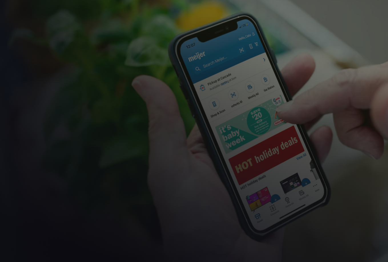
Co-leading the design of pickup and delivery for the Meijer app, transforming a coupon and weekly-ad platform into a full grocery e-commerce experience, launched October 2018.
THE PROBLEM
In 2018, mobile already accounted for ~40% of US ecommerce ($208B), with forecasts to top 50% by 2021. Globally, phones were set to drive the majority of online retail. A clear signal that mobile-first was the future and Meijer had yet to bring shopping to their own app.
THE ASSIGNMENT
Rethink the entire app's information architecture to support a full shopping and fulfillment experience alongside the existing savings features - without making either feel like an afterthought.
THE RELEASE PLAN & RESULTS
The Meijer mobile shopping experience has been live since October 2018 and is available in both the Apple Store and Google Play store where it holds a 4.6 star rating and receives tens of thousands of new downloads per month.
Read Supermarket New’s press release article here:
Meijer adds store pickup to home deliveryPROJECT RUNDOWN
My Role
UX Designer & Researcher
focus area
Mobile
Device
Apple & Android
status
Shipped — in production
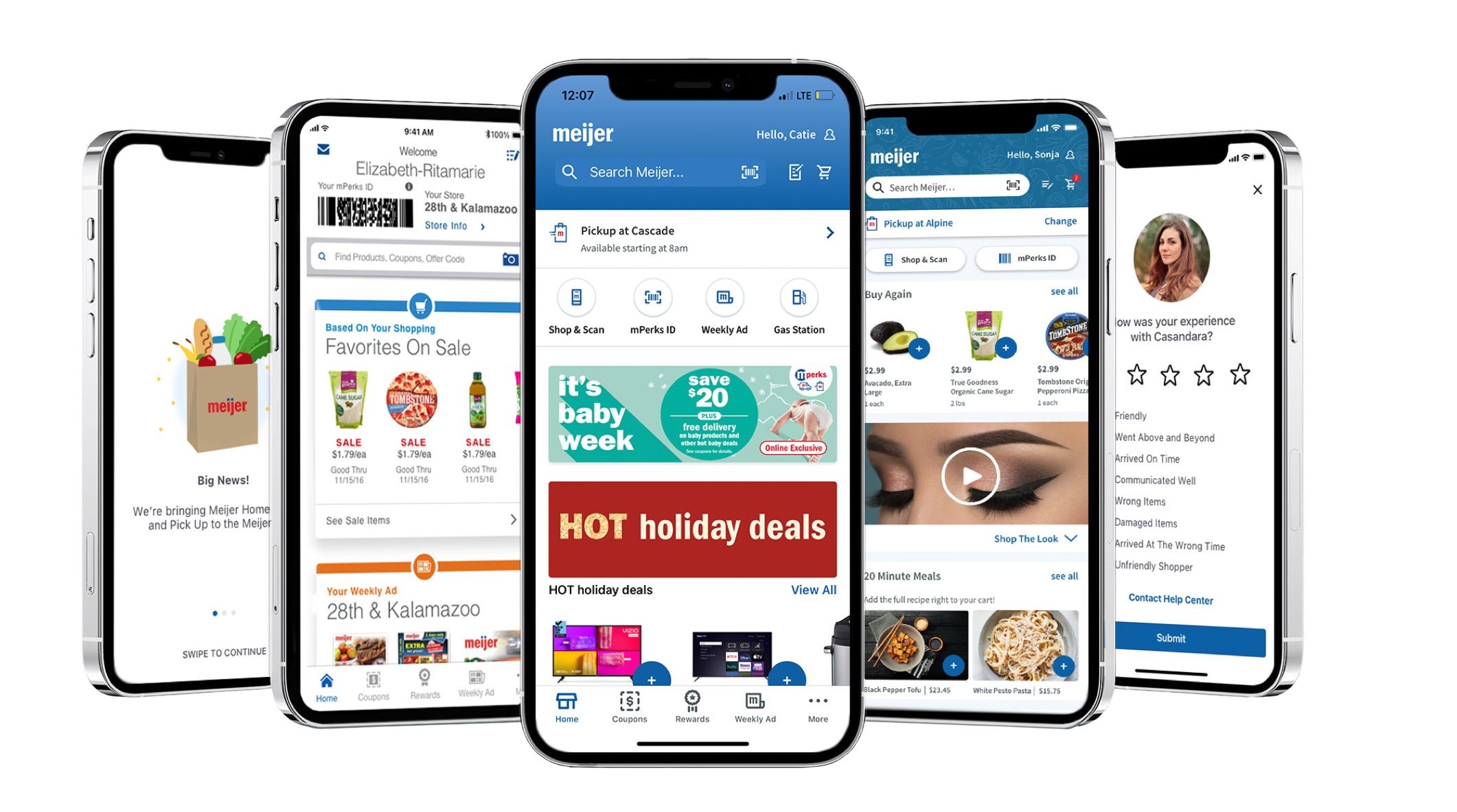
The Meijer App: Pickup and Home Delivery
DESIGN PROCESS
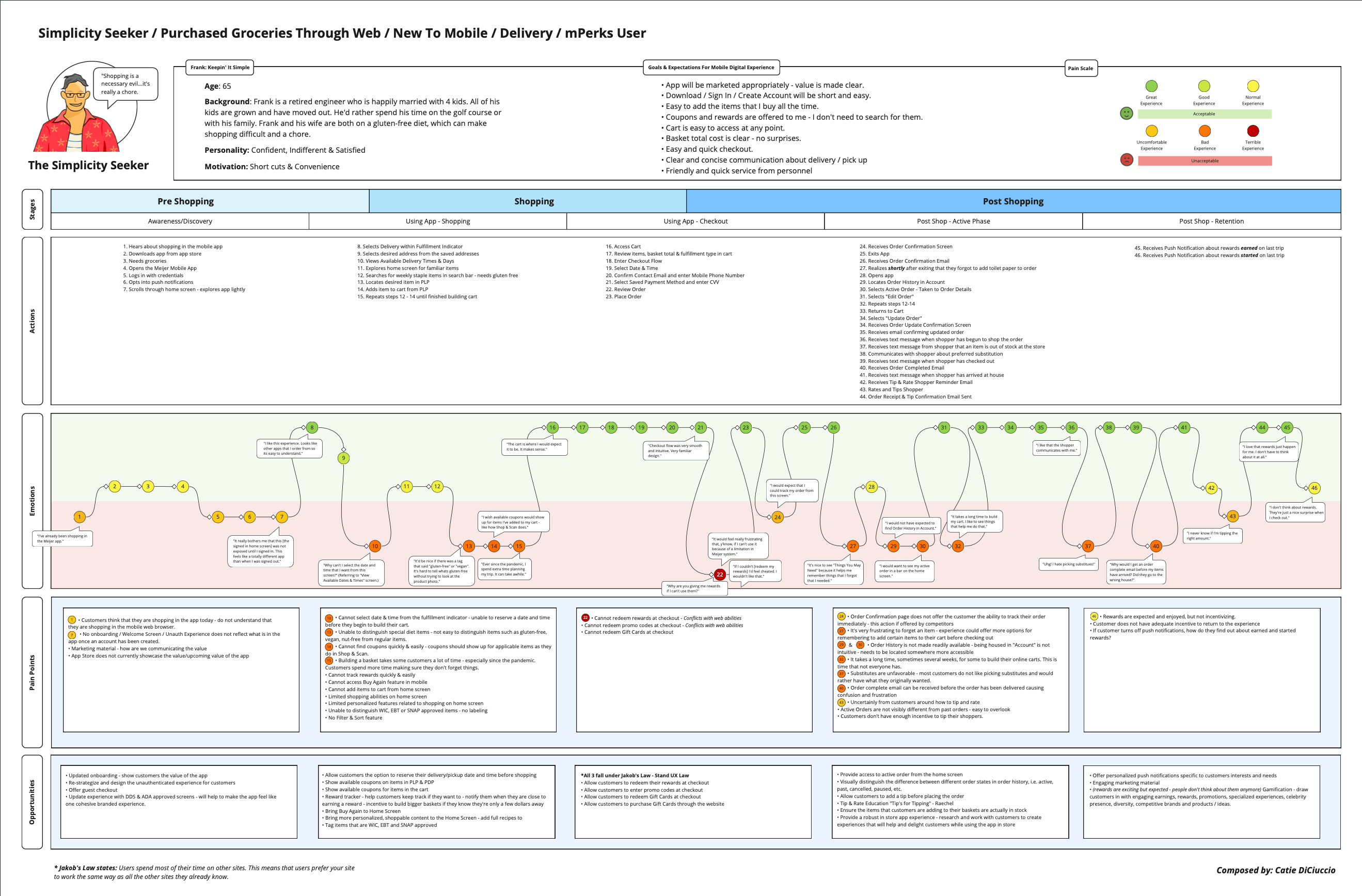
The design process began with competitive benchmarking and wireframing. Understanding what competitors offered helped us identify where we needed to match industry expectations and where we could differentiate Meijer’s experience. We also created customer archetypes, each paired with a journey map, to understand how different types of shoppers would move through delivery and pickup. Archetypes like the Simplicity Seeker, a shopper who wants to get in, order, and get on with their day, helped keep the experience focused and free of unnecessary steps. Just as important, we made sure not to remove or disrupt the features loyal customers already loved. That included the personalized experiences released just a year earlier: Favorites on Sale, Discover New Items, and Buy Again. The goal was to introduce home delivery and pickup in a way that felt like a natural extension of the app customers already knew.
We validated the designs through in-person usability testing, observing how customers moved through the new shopping flows and where they hesitated or got stuck. Those sessions guided refinements to the experience before release.
I worked closely with engineering, business, and the web design team throughout the project to keep the app experience aligned with Meijer’s web platform and feasible to build. The final design balanced new online shopping capabilities with the familiar, personalized experience Meijer customers already relied on.
The Simplicity SeekerMeijer Mobile Shopping & Home Delivery App ArchetypeI create this customer journey map to help our team understand the needs of our highlighted customers types.
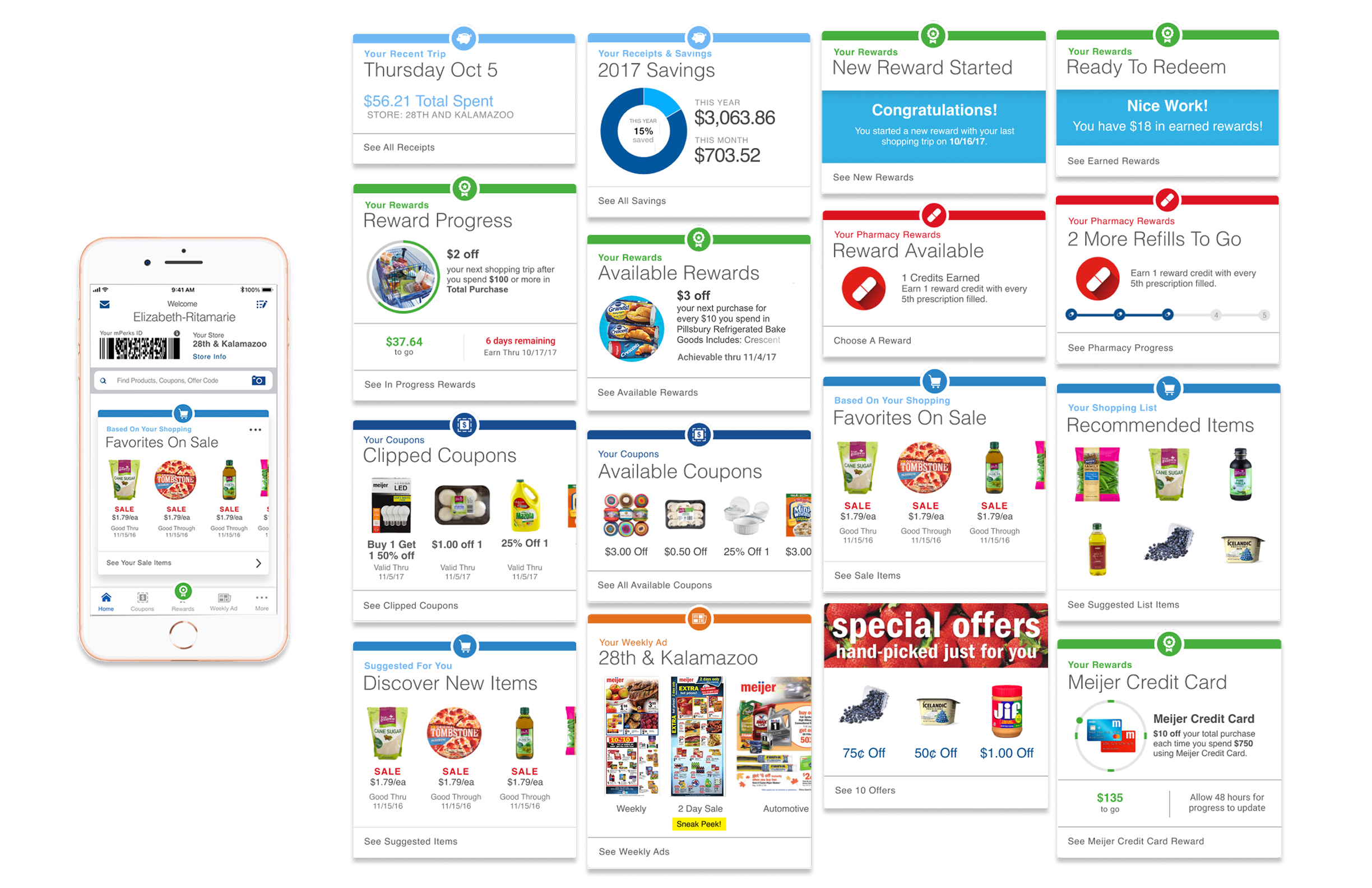
The Personalized Home Screen (pre-shopping)
We worked hard to ensure that we brought as much of the personalized experience as we could into the new Meijer app. Above is a showcase of the personalized home screen cards that myself and a small team of engineers and one other designer created prior to shopping.
I designed the Favorites on Sale, Recommended Items, and Discover New Items experiences, along with the app's rewards experiences, the surfaces responsible for turning each shopper's data into personalized, actionable recommendations. At the core was a proprietary algorithm, built by one of our in-house developers, that tracked each customer's unique shopping behavior. It learned purchase frequency to predict when a shopper might be running low on staples, then paired those predictions with sale data to surface the right items at the right moment - favorite products on sale, discounts on frequently purchased goods, and new items worth discovering.
Wireframing
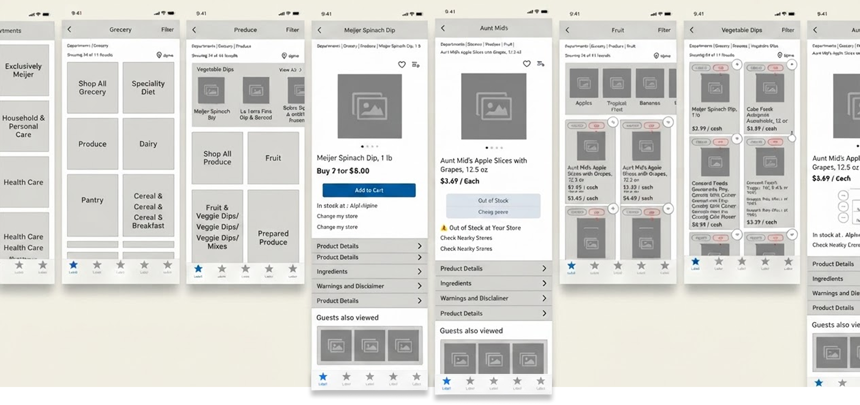
Before moving to high-fidelity design, I wireframed the core in-app shopping flows - department navigation, category and product browsing, product detail pages, and stock/store availability. These low-fidelity screens let us pressure-test the information architecture, layout, and user flow early, aligning the team on structure before investing in visual design.
First Tested Iteration
This section captures the first end-to-end design of Meijer's in-app Pickup and Delivery experience — the version we put in front of users for testing. Building on the personalization and rewards work already in the app, this iteration introduced full grocery shopping directly within the Meijer app for the first time.
The flow covered the complete shopping journey: onboarding screens that eased existing mPerks users into the new experience, department and category browsing, search with recent-search recall, a shopping list, and a cart with real-time totals, delivery/pickup fee transparency, and item-level notes (e.g., "choose an apple with minimal bruises"). It also unified the new shopping features with existing tools — mPerks barcode scanning, coupons, receipts, and account management — into a single, coherent app.
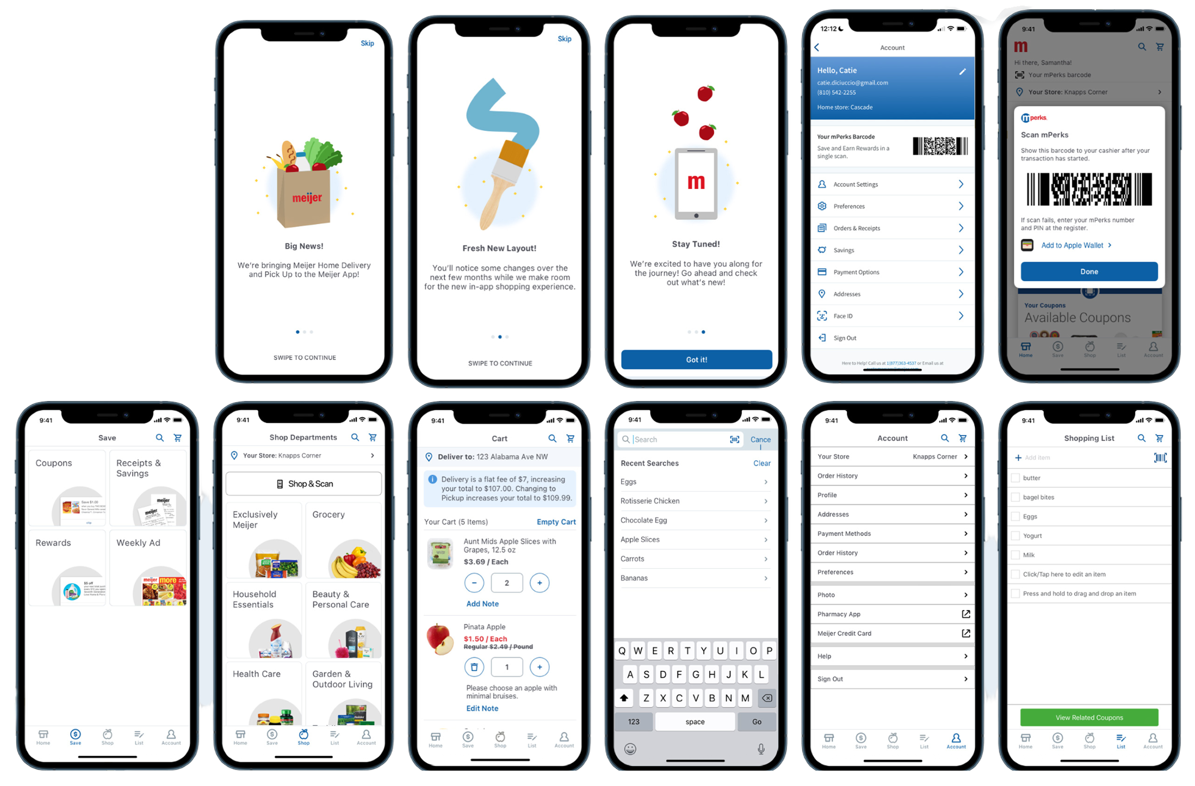
Because this was the build we tested, it served as the foundation for validating the concept with real customers and surfacing the usability insights that shaped later iterations.
VALIDATION
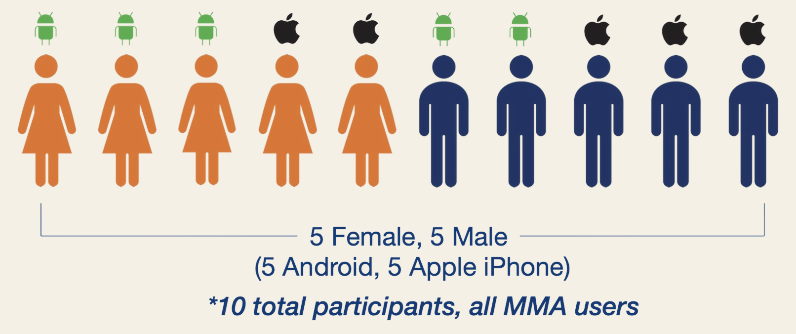
To validate the first Pickup and Delivery build before development, we ran usability testing with 10 participants — balanced across gender (5 female, 5 male) and device type (5 Android, 5 iPhone), all existing Meijer app users. The mixed sample let us confirm the experience held up across both platforms and represented our actual customer base.
Results
Testers were enthusiastic about the introduction of shopping to the Meijer app and noted that the experience felt familiar — closely mirroring the mobile shopping patterns they already knew from other retailers. The sessions also surfaced two clear, actionable insights: customers preferred a floating action button (FAB) for adding items to their cart over an exposed quantity stepper, and they expected quicker access to Shop & Scan.
We acted on both. We replaced the quantity stepper with a floating action button for a cleaner, more intuitive add-to-cart interaction, and we surfaced a quick-access Shop & Scan button on the home screen. These refinements tightened the experience before it moved into development.
SOLUTIONS & RESULTS
The final launched version of the Meijer app - the culmination of the personalization work, wireframing, first-build design, and usability testing that came before it. Full in-app grocery shopping is now live alongside the app's existing loyalty and savings tools, unified into a single, polished experience.
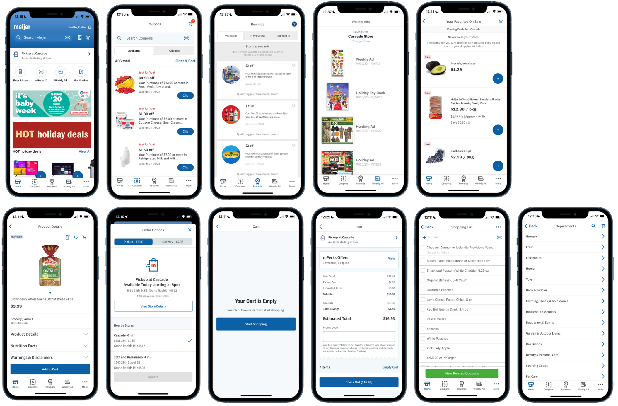
The shipped app carries the testing insights all the way through: Shop & Scan sits front and center in the home screen's quick-action row, and the plus FAB appears throughout browsing for a fast, familiar add-to-cart interaction. The end-to-end flow is complete - customers can browse departments, search or work from a shopping list, view rich product detail pages, choose pickup or delivery, apply mPerks offers and coupons, and check out with a transparent, itemized cart total.
The result is a cohesive experience that brings Meijer's savings, rewards, and shopping into one place, turning the app from a loyalty and coupon tool into a complete grocery shopping platform.
REFLECTIONS
This is a forward-looking concept I pitched shortly before leaving Meijer - the direction I would have pursued with more time. Where the shipped app made grocery shopping possible, this vision reimagined the home screen as a discovery and inspiration engine, designed to grow basket size and deepen engagement while staying rooted in Meijer's Jobs to be Done and Meijer Mindsets frameworks.
The centerpiece was shoppable content: collections of Meijer products pulled into how-to videos — 15-minute meals, recreate-this makeup look - where a customer could add every item from the video straight to their cart in one tap. Complementing it, a "Grab It on the Go" section surfaced the impulse buys shoppers normally only encounter in the checkout lane (magazines, candy), bringing that basket-building moment into the digital experience. The concept also gave visibility to general merchandise like apparel - categories the app hadn't showcased before - opening the door to cross-department discovery.
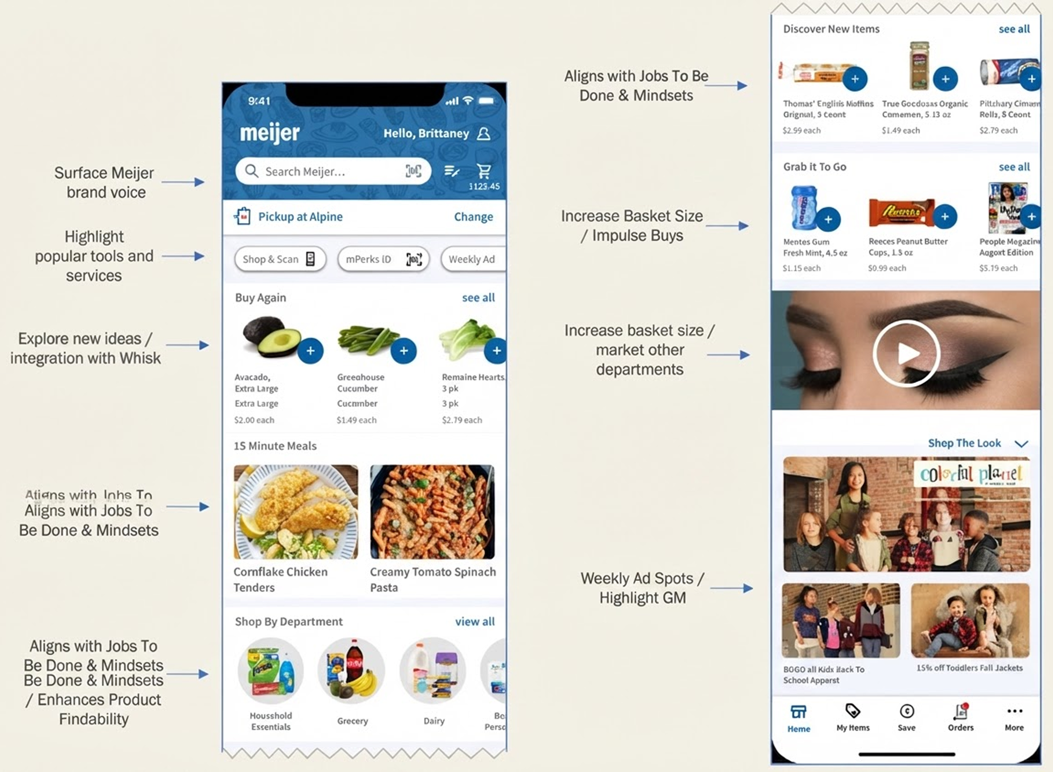
I designed the home screen as a set of intent-driven sections mapped to real customer mindsets: quick weeknight dinners for the family, fast product discovery, and everyday problem-solving. I also planned for integration with Whisk, a recipe-saving and meal-planning partnership Meijer was exploring at the time — connecting discovery moments like "Discover New Items" to recipe ideas and planning tools.
Taken together, the concept pushed the app beyond transaction toward inspiration - helping customers find ideas, not just items, and giving Meijer new, natural surfaces to merchandise across the store.
Meijer App
Co-leading the design of pickup and delivery for the Meijer app, transforming a coupon and weekly-ad platform into a full grocery e-commerce experience, launched October 2018.
THE PROBLEM
In 2018, mobile already accounted for ~40% of US ecommerce ($208B), with forecasts to top 50% by 2021. Globally, phones were set to drive the majority of online retail. A clear signal that mobile-first was the future and Meijer had yet to bring shopping to their own app.
THE ASSIGNMENT
Rethink the entire app's information architecture to support a full shopping and fulfillment experience alongside the existing savings features - without making either feel like an afterthought.
THE RELEASE PLAN & RESULTS
The Meijer mobile shopping experience has been live since October 2018 and is available in both the Apple Store and Google Play store where it holds a 4.6 star rating and receives tens of thousands of new downloads per month.
Read Supermarket New’s press release article here:
Meijer adds store pickup to home deliveryPROJECT RUNDOWN
My Role
UX Designer & Researcher
focus area
Mobile
Device
Apple & Android
status
Shipped — in production
The Meijer App: Pickup and Home Delivery
DESIGN PROCESS
The design process began with competitive benchmarking and wireframing. Understanding what competitors offered helped us identify where we needed to match industry expectations and where we could differentiate Meijer’s experience. We also created customer archetypes, each paired with a journey map, to understand how different types of shoppers would move through delivery and pickup. Archetypes like the Simplicity Seeker, a shopper who wants to get in, order, and get on with their day, helped keep the experience focused and free of unnecessary steps. Just as important, we made sure not to remove or disrupt the features loyal customers already loved. That included the personalized experiences released just a year earlier: Favorites on Sale, Discover New Items, and Buy Again. The goal was to introduce home delivery and pickup in a way that felt like a natural extension of the app customers already knew.
We validated the designs through in-person usability testing, observing how customers moved through the new shopping flows and where they hesitated or got stuck. Those sessions guided refinements to the experience before release.
I worked closely with engineering, business, and the web design team throughout the project to keep the app experience aligned with Meijer’s web platform and feasible to build. The final design balanced new online shopping capabilities with the familiar, personalized experience Meijer customers already relied on.
The Simplicity SeekerMeijer Mobile Shopping & Home Delivery App ArchetypeI create this customer journey map to help our team understand the needs of our highlighted customers types.
The Personalized Home Screen (pre-shopping)
We worked hard to ensure that we brought as much of the personalized experience as we could into the new Meijer app. Above is a showcase of the personalized home screen cards that myself and a small team of engineers and one other designer created prior to shopping.
I designed the Favorites on Sale, Recommended Items, and Discover New Items experiences, along with the app's rewards experiences, the surfaces responsible for turning each shopper's data into personalized, actionable recommendations. At the core was a proprietary algorithm, built by one of our in-house developers, that tracked each customer's unique shopping behavior. It learned purchase frequency to predict when a shopper might be running low on staples, then paired those predictions with sale data to surface the right items at the right moment - favorite products on sale, discounts on frequently purchased goods, and new items worth discovering.
Wireframing
Before moving to high-fidelity design, I wireframed the core in-app shopping flows - department navigation, category and product browsing, product detail pages, and stock/store availability. These low-fidelity screens let us pressure-test the information architecture, layout, and user flow early, aligning the team on structure before investing in visual design.
First Tested Iteration
This section captures the first end-to-end design of Meijer's in-app Pickup and Delivery experience — the version we put in front of users for testing. Building on the personalization and rewards work already in the app, this iteration introduced full grocery shopping directly within the Meijer app for the first time.
The flow covered the complete shopping journey: onboarding screens that eased existing mPerks users into the new experience, department and category browsing, search with recent-search recall, a shopping list, and a cart with real-time totals, delivery/pickup fee transparency, and item-level notes (e.g., "choose an apple with minimal bruises"). It also unified the new shopping features with existing tools — mPerks barcode scanning, coupons, receipts, and account management — into a single, coherent app.
Because this was the build we tested, it served as the foundation for validating the concept with real customers and surfacing the usability insights that shaped later iterations.
VALIDATION
To validate the first Pickup and Delivery build before development, we ran usability testing with 10 participants — balanced across gender (5 female, 5 male) and device type (5 Android, 5 iPhone), all existing Meijer app users. The mixed sample let us confirm the experience held up across both platforms and represented our actual customer base.
Results
Testers were enthusiastic about the introduction of shopping to the Meijer app and noted that the experience felt familiar — closely mirroring the mobile shopping patterns they already knew from other retailers. The sessions also surfaced two clear, actionable insights: customers preferred a floating action button (FAB) for adding items to their cart over an exposed quantity stepper, and they expected quicker access to Shop & Scan.
We acted on both. We replaced the quantity stepper with a floating action button for a cleaner, more intuitive add-to-cart interaction, and we surfaced a quick-access Shop & Scan button on the home screen. These refinements tightened the experience before it moved into development.
SOLUTIONS & RESULTS
The final launched version of the Meijer app - the culmination of the personalization work, wireframing, first-build design, and usability testing that came before it. Full in-app grocery shopping is now live alongside the app's existing loyalty and savings tools, unified into a single, polished experience.
The shipped app carries the testing insights all the way through: Shop & Scan sits front and center in the home screen's quick-action row, and the plus FAB appears throughout browsing for a fast, familiar add-to-cart interaction. The end-to-end flow is complete - customers can browse departments, search or work from a shopping list, view rich product detail pages, choose pickup or delivery, apply mPerks offers and coupons, and check out with a transparent, itemized cart total.
The result is a cohesive experience that brings Meijer's savings, rewards, and shopping into one place, turning the app from a loyalty and coupon tool into a complete grocery shopping platform.
REFLECTIONS
This is a forward-looking concept I pitched shortly before leaving Meijer - the direction I would have pursued with more time. Where the shipped app made grocery shopping possible, this vision reimagined the home screen as a discovery and inspiration engine, designed to grow basket size and deepen engagement while staying rooted in Meijer's Jobs to be Done and Meijer Mindsets frameworks.
The centerpiece was shoppable content: collections of Meijer products pulled into how-to videos — 15-minute meals, recreate-this makeup look - where a customer could add every item from the video straight to their cart in one tap. Complementing it, a "Grab It on the Go" section surfaced the impulse buys shoppers normally only encounter in the checkout lane (magazines, candy), bringing that basket-building moment into the digital experience. The concept also gave visibility to general merchandise like apparel - categories the app hadn't showcased before - opening the door to cross-department discovery.
I designed the home screen as a set of intent-driven sections mapped to real customer mindsets: quick weeknight dinners for the family, fast product discovery, and everyday problem-solving. I also planned for integration with Whisk, a recipe-saving and meal-planning partnership Meijer was exploring at the time — connecting discovery moments like "Discover New Items" to recipe ideas and planning tools.
Taken together, the concept pushed the app beyond transaction toward inspiration - helping customers find ideas, not just items, and giving Meijer new, natural surfaces to merchandise across the store.
Meijer App
Co-leading the design of pickup and delivery for the Meijer app, transforming a coupon and weekly-ad platform into a full grocery e-commerce experience, launched October 2018.
THE PROBLEM
In 2018, mobile already accounted for ~40% of US ecommerce ($208B), with forecasts to top 50% by 2021. Globally, phones were set to drive the majority of online retail. A clear signal that mobile-first was the future and Meijer had yet to bring shopping to their own app.
THE ASSIGNMENT
Rethink the entire app's information architecture to support a full shopping and fulfillment experience alongside the existing savings features - without making either feel like an afterthought.
THE RELEASE PLAN & RESULTS
The Meijer mobile shopping experience has been live since October 2018 and is available in both the Apple Store and Google Play store where it holds a 4.6 star rating and receives tens of thousands of new downloads per month.
Read Supermarket New’s press release article here:
Meijer adds store pickup to home deliveryPROJECT RUNDOWN
My Role
UX Designer & Researcher
focus area
Mobile
Device
Apple & Android
status
Shipped — in production
The Meijer App: Pickup and Home Delivery
DESIGN PROCESS
The design process began with competitive benchmarking and wireframing. Understanding what competitors offered helped us identify where we needed to match industry expectations and where we could differentiate Meijer’s experience. We also created customer archetypes, each paired with a journey map, to understand how different types of shoppers would move through delivery and pickup. Archetypes like the Simplicity Seeker, a shopper who wants to get in, order, and get on with their day, helped keep the experience focused and free of unnecessary steps. Just as important, we made sure not to remove or disrupt the features loyal customers already loved. That included the personalized experiences released just a year earlier: Favorites on Sale, Discover New Items, and Buy Again. The goal was to introduce home delivery and pickup in a way that felt like a natural extension of the app customers already knew.
We validated the designs through in-person usability testing, observing how customers moved through the new shopping flows and where they hesitated or got stuck. Those sessions guided refinements to the experience before release.
I worked closely with engineering, business, and the web design team throughout the project to keep the app experience aligned with Meijer’s web platform and feasible to build. The final design balanced new online shopping capabilities with the familiar, personalized experience Meijer customers already relied on.
The Simplicity SeekerMeijer Mobile Shopping & Home Delivery App ArchetypeI create this customer journey map to help our team understand the needs of our highlighted customers types.
The Personalized Home Screen (pre-shopping)
We worked hard to ensure that we brought as much of the personalized experience as we could into the new Meijer app. Above is a showcase of the personalized home screen cards that myself and a small team of engineers and one other designer created prior to shopping.
I designed the Favorites on Sale, Recommended Items, and Discover New Items experiences, along with the app's rewards experiences, the surfaces responsible for turning each shopper's data into personalized, actionable recommendations. At the core was a proprietary algorithm, built by one of our in-house developers, that tracked each customer's unique shopping behavior. It learned purchase frequency to predict when a shopper might be running low on staples, then paired those predictions with sale data to surface the right items at the right moment - favorite products on sale, discounts on frequently purchased goods, and new items worth discovering.
Wireframing
Before moving to high-fidelity design, I wireframed the core in-app shopping flows - department navigation, category and product browsing, product detail pages, and stock/store availability. These low-fidelity screens let us pressure-test the information architecture, layout, and user flow early, aligning the team on structure before investing in visual design.
First Tested Iteration
This section captures the first end-to-end design of Meijer's in-app Pickup and Delivery experience — the version we put in front of users for testing. Building on the personalization and rewards work already in the app, this iteration introduced full grocery shopping directly within the Meijer app for the first time.
The flow covered the complete shopping journey: onboarding screens that eased existing mPerks users into the new experience, department and category browsing, search with recent-search recall, a shopping list, and a cart with real-time totals, delivery/pickup fee transparency, and item-level notes (e.g., "choose an apple with minimal bruises"). It also unified the new shopping features with existing tools — mPerks barcode scanning, coupons, receipts, and account management — into a single, coherent app.
Because this was the build we tested, it served as the foundation for validating the concept with real customers and surfacing the usability insights that shaped later iterations.
VALIDATION
To validate the first Pickup and Delivery build before development, we ran usability testing with 10 participants — balanced across gender (5 female, 5 male) and device type (5 Android, 5 iPhone), all existing Meijer app users. The mixed sample let us confirm the experience held up across both platforms and represented our actual customer base.
Results
Testers were enthusiastic about the introduction of shopping to the Meijer app and noted that the experience felt familiar — closely mirroring the mobile shopping patterns they already knew from other retailers. The sessions also surfaced two clear, actionable insights: customers preferred a floating action button (FAB) for adding items to their cart over an exposed quantity stepper, and they expected quicker access to Shop & Scan.
We acted on both. We replaced the quantity stepper with a floating action button for a cleaner, more intuitive add-to-cart interaction, and we surfaced a quick-access Shop & Scan button on the home screen. These refinements tightened the experience before it moved into development.
SOLUTIONS & RESULTS
The final launched version of the Meijer app - the culmination of the personalization work, wireframing, first-build design, and usability testing that came before it. Full in-app grocery shopping is now live alongside the app's existing loyalty and savings tools, unified into a single, polished experience.
The shipped app carries the testing insights all the way through: Shop & Scan sits front and center in the home screen's quick-action row, and the plus FAB appears throughout browsing for a fast, familiar add-to-cart interaction. The end-to-end flow is complete - customers can browse departments, search or work from a shopping list, view rich product detail pages, choose pickup or delivery, apply mPerks offers and coupons, and check out with a transparent, itemized cart total.
The result is a cohesive experience that brings Meijer's savings, rewards, and shopping into one place, turning the app from a loyalty and coupon tool into a complete grocery shopping platform.
REFLECTIONS
This is a forward-looking concept I pitched shortly before leaving Meijer - the direction I would have pursued with more time. Where the shipped app made grocery shopping possible, this vision reimagined the home screen as a discovery and inspiration engine, designed to grow basket size and deepen engagement while staying rooted in Meijer's Jobs to be Done and Meijer Mindsets frameworks.
The centerpiece was shoppable content: collections of Meijer products pulled into how-to videos — 15-minute meals, recreate-this makeup look - where a customer could add every item from the video straight to their cart in one tap. Complementing it, a "Grab It on the Go" section surfaced the impulse buys shoppers normally only encounter in the checkout lane (magazines, candy), bringing that basket-building moment into the digital experience. The concept also gave visibility to general merchandise like apparel - categories the app hadn't showcased before - opening the door to cross-department discovery.
I designed the home screen as a set of intent-driven sections mapped to real customer mindsets: quick weeknight dinners for the family, fast product discovery, and everyday problem-solving. I also planned for integration with Whisk, a recipe-saving and meal-planning partnership Meijer was exploring at the time — connecting discovery moments like "Discover New Items" to recipe ideas and planning tools.
Taken together, the concept pushed the app beyond transaction toward inspiration - helping customers find ideas, not just items, and giving Meijer new, natural surfaces to merchandise across the store.